The Challenge
As the HNext product surface grew, inconsistency between teams was slowing delivery and eroding trust in the interface. Similar patterns — tables, filters, modals, form fields — were being rebuilt slightly differently in every project.
Business Opportunity
A shared design system would reduce rework, speed up onboarding for new designers and engineers, and raise the baseline quality and accessibility of everything shipped.
The Approach
I built the system from real product needs rather than a theoretical component catalog — starting with the patterns that appeared in the booking redesign, then extracting and documenting them for reuse.
- Audited existing UI for duplication and inconsistency across booking, search, and admin surfaces
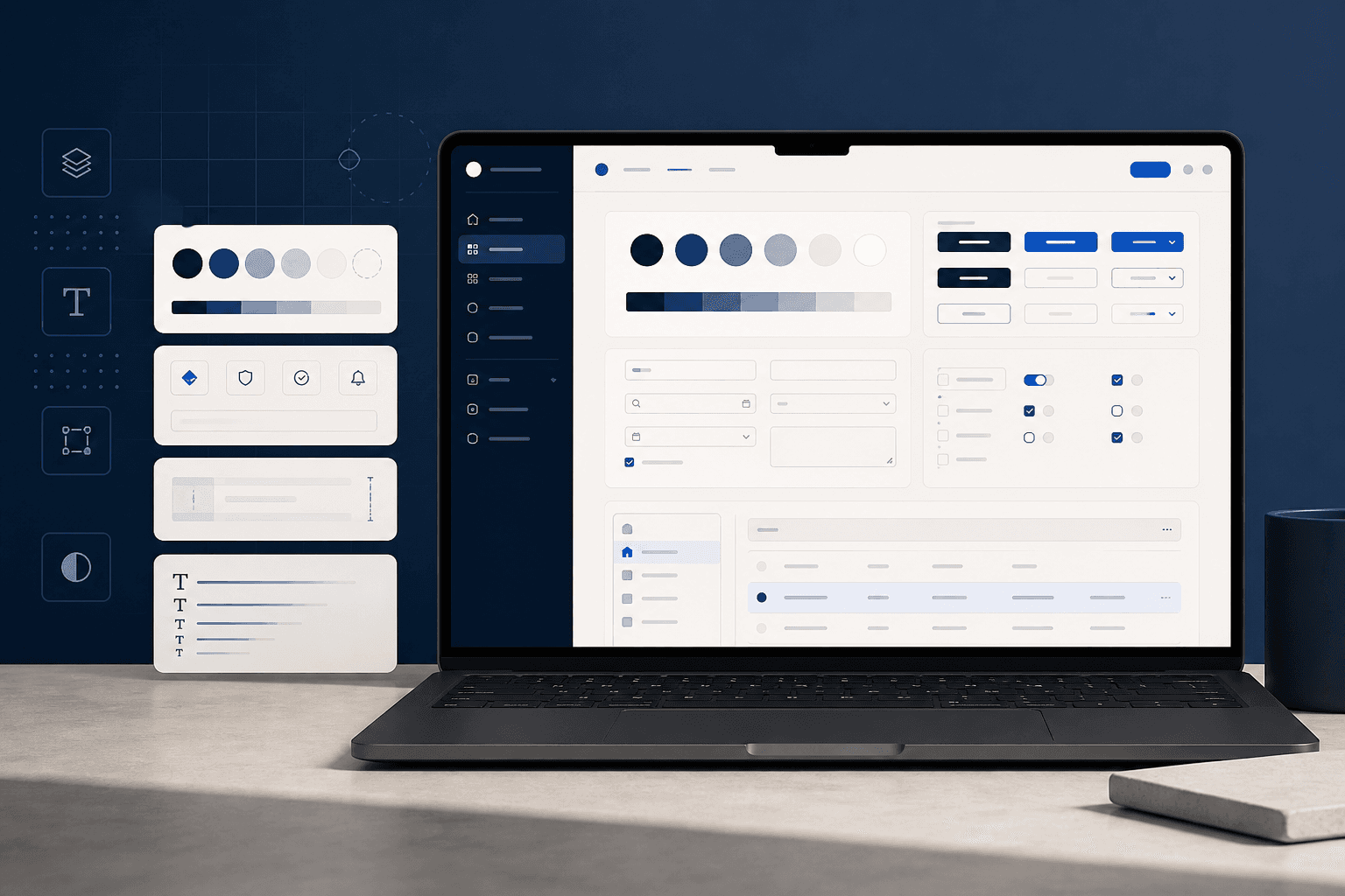
- Defined design tokens for colour, type, spacing, and elevation aligned to enterprise density requirements
- Built core components: buttons, inputs, data tables, filter bars, cards, modals, and navigation shells
- Wrote usage documentation with do/don't examples — not just specs, but decision guidance
- Partnered with engineering on implementation parity between Figma and code
- Prioritized accessibility: focus states, contrast ratios, and keyboard paths baked into components
Key design decisions
- Start from shipped work: Components extracted from production-ready booking UI, not abstract exercises
- Enterprise density: Data-heavy layouts supported without sacrificing readability
- Document decisions: Each component explains when to use it — reducing one-off variants
Outcomes
The system became the default starting point for new HNext features. Teams shipped faster with fewer design-dev handoff loops, and the booking project components seeded patterns now used across search, comparison, and confirmation flows.