Overview
The organization relied on a third-party campaign management platform for email communications and customer engagement.
While the solution fulfilled basic campaign requirements, it introduced limitations around scalability, security, operational flexibility, and ownership of customer data. Marketing teams faced challenges managing campaigns efficiently, and the platform's infrastructure limited the number of users that could be targeted in a single campaign.
To address these challenges, we designed and built an in-house communication platform that provides greater control, security, scalability, and a significantly improved campaign creation experience.
Background
The existing communication experience relied on a third-party platform to create and deliver email campaigns. As campaign volumes and personalization requirements grew, this created challenges around customer data security, scalability, platform dependency, and operational flexibility.
The existing platform could support campaigns for approximately 500,000 recipients at a time, while the business needed a solution capable of reaching millions of users at scale. This became the driving force behind building an in-house communication platform.
The Business Challenge
The existing campaign management process relied heavily on a third-party provider.
This created several business and technical challenges:
Customer audience data was stored and processed through an external system.
Limited control over platform capabilities and future enhancements.
Campaign creation and management workflows were difficult to understand.
Poor visibility into campaign status and performance.
Template assignment and audience management required multiple steps.
The platform supported campaigns for approximately 500,000 users at a time.
Scaling communication to millions of users was challenging and costly.
These limitations impacted campaign efficiency, business agility, and long-term scalability.
Why build our own communication platform?
Data security
Keep sensitive customer and audience data within our own ecosystem.
Scalability
Move beyond the existing ~500K recipient limitation, with a long-term goal of supporting campaigns reaching 5M+ users.
Reliability
Gain greater control over system stability, delivery infrastructure, and operational resilience.
Flexibility
Build workflows around our business requirements instead of adapting to third-party platform limitations.
Business agility
Allow marketing teams to create, modify, schedule, and launch campaigns without depending on engineering for routine tasks.
Goals
Business Goals
- Reduce dependency on third-party tools.
- Improve customer data security.
- Enable large-scale campaign delivery.
- Increase marketing team efficiency.
- Create a future-ready communication platform.
User Goals
- Create campaigns faster.
- Easily identify campaign status.
- Manage audiences efficiently.
- Reuse existing campaigns.
- Reduce errors during campaign setup.
Understanding Users
- Supporting complex marketing workflows.
- Handling millions of potential recipients.
- Simplifying technical campaign configurations.
- Balancing flexibility with usability.
- Supporting draft, review, scheduling, and publishing states.
- Ensuring scalability for future communication channels.
Through discussions with marketing and campaign management teams, we identified several recurring pain points:
Campaign Creation Was Complex
Users struggled to understand what information was required and where to start.
Poor Workflow Visibility
There was no clear indication of progress throughout campaign creation.
Difficult Campaign Management
Finding, updating, and reusing existing campaigns required multiple actions.
Audience Selection Challenges
Audience targeting was one of the most critical tasks but lacked prominence in the workflow.
Template Assignment Confusion
Users often struggled to determine which template was linked to a campaign.
Design Challenges
Designing an enterprise communication platform introduced several challenges:
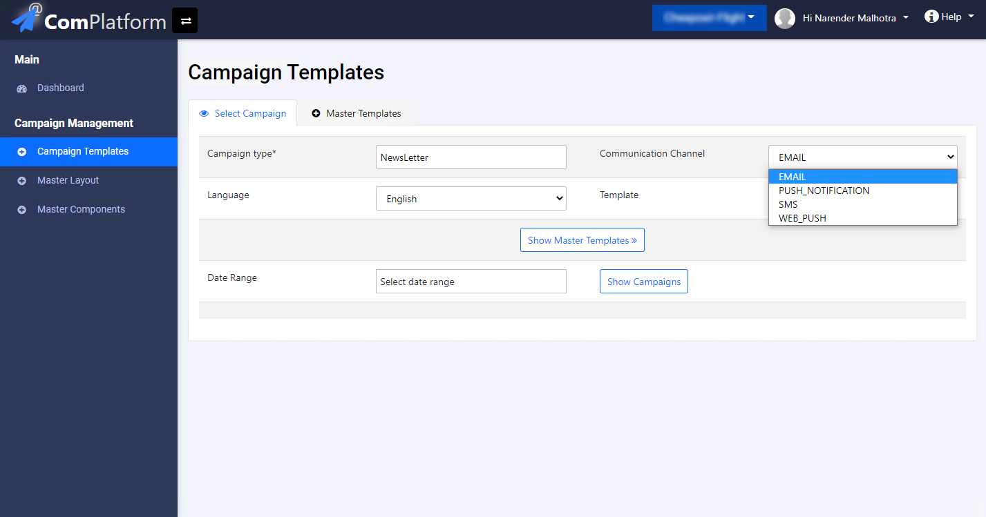
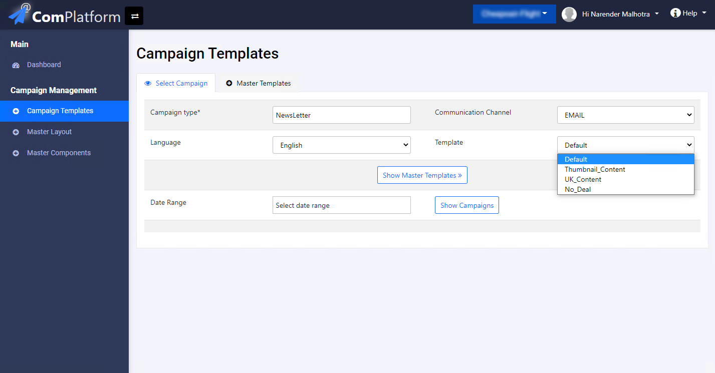
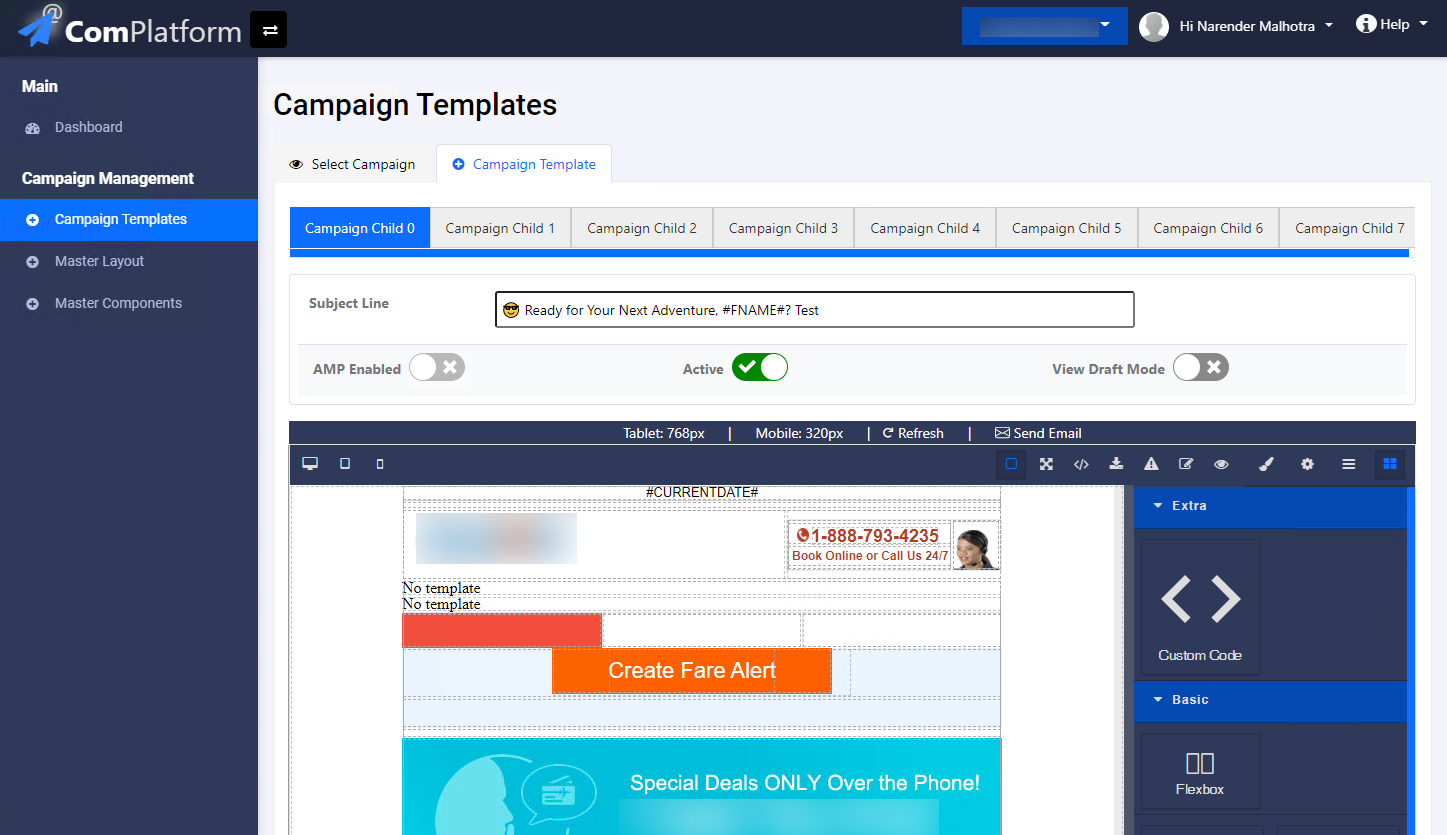
Existing Experience
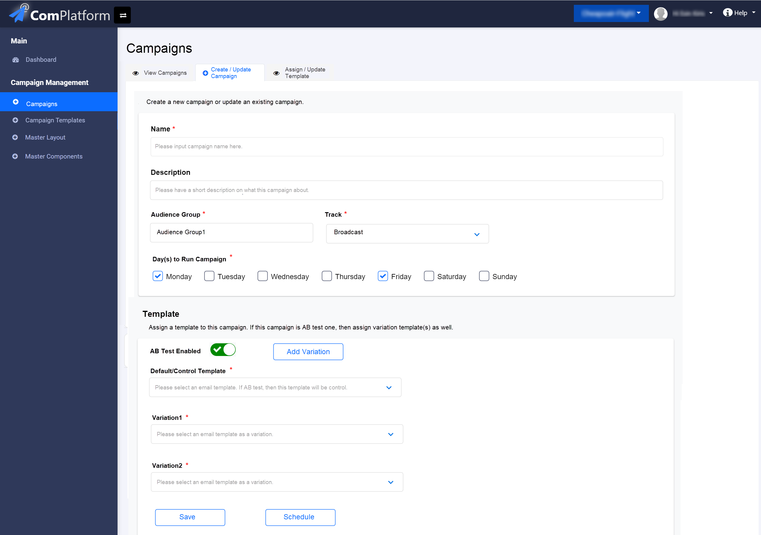
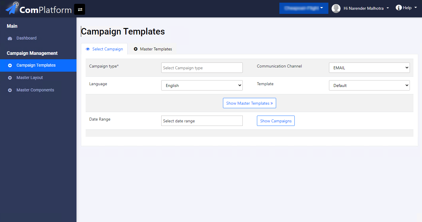
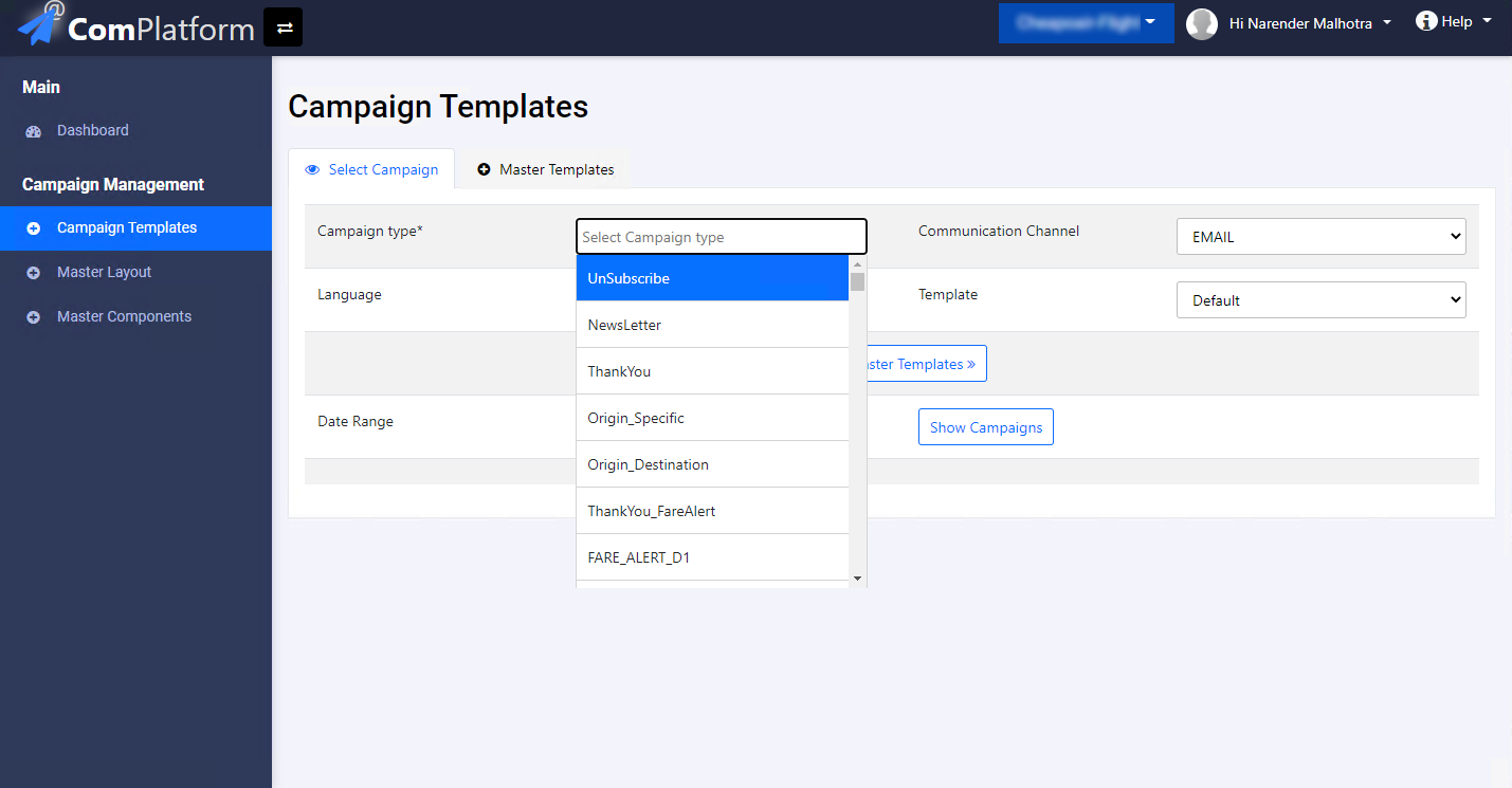
Problems with the Current Platform
- Multiple disconnected workflows.
- Poor discoverability of campaign actions.
- Limited campaign visibility.
- Difficult template management.
- Confusing campaign setup process.
- No guided creation experience.
- Heavy reliance on system knowledge.
Design Strategy
We simplified the experience around two primary user objectives:
1. Manage Existing Campaigns
Everything related to monitoring, editing, duplicating, and reviewing campaigns belongs in one place.
2. Create New Campaigns
Everything related to creating a campaign follows a structured step-by-step workflow.
This separation reduced cognitive load and aligned the product with users' mental models.
Key UX Decisions
Separate Campaign Management from Campaign Creation
Users no longer switch between multiple tabs and workflows.
Audience First Approach
Audience selection became the first step because it directly influences campaign content and communication strategy.
Guided 4-Step Workflow
Users always understand:
- Where they are
- What information is needed
- What comes next
Draft Support
Campaigns can be saved and resumed at any stage.
Reusable Campaigns
Users can duplicate existing campaigns and launch variations without recreating configurations.
Solution
View Campaigns
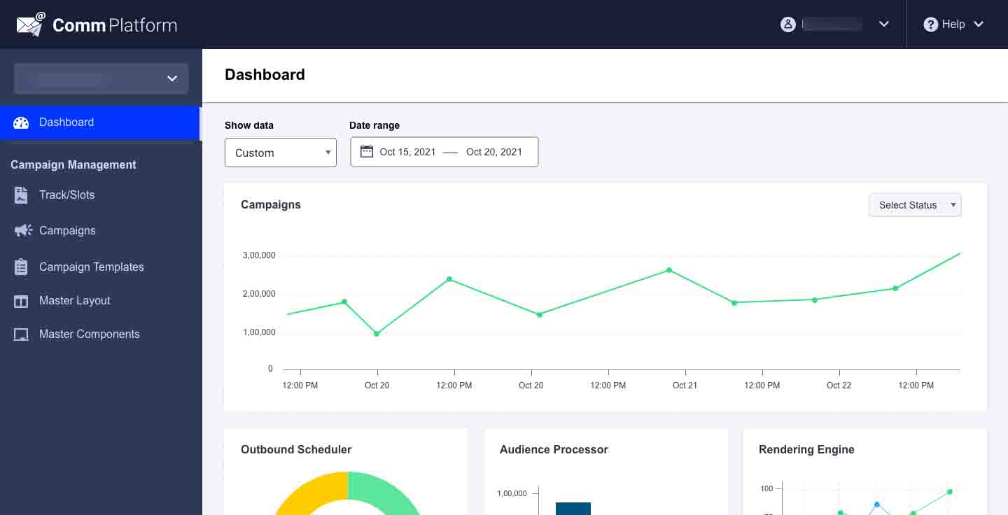
A centralized campaign management dashboard allows users to:
- View all campaigns in one place.
- Filter by status.
- Monitor active campaigns.
- Access completed campaigns.
- Stop or edit campaigns.
- Duplicate successful campaigns.
This significantly reduces operational effort and speeds up campaign execution.
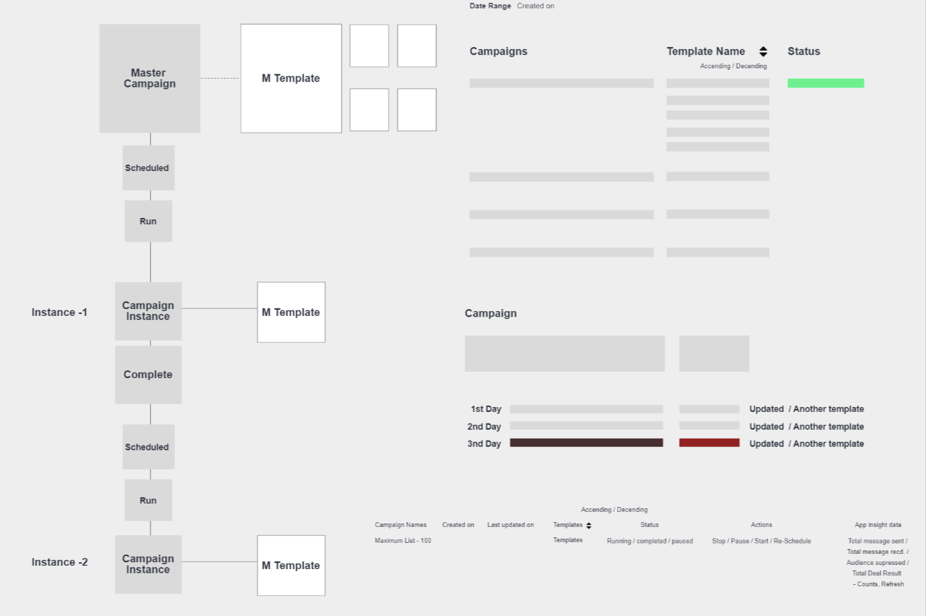
Core user flow
The end-to-end flow connects audience selection, content setup, scheduling, and automation triggers in a single navigable path — so users always know where they are in the campaign lifecycle.
Wireframes
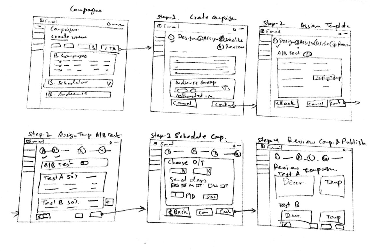
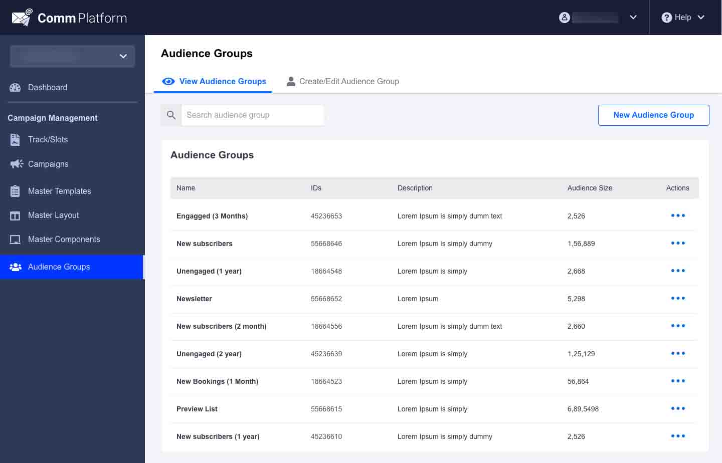
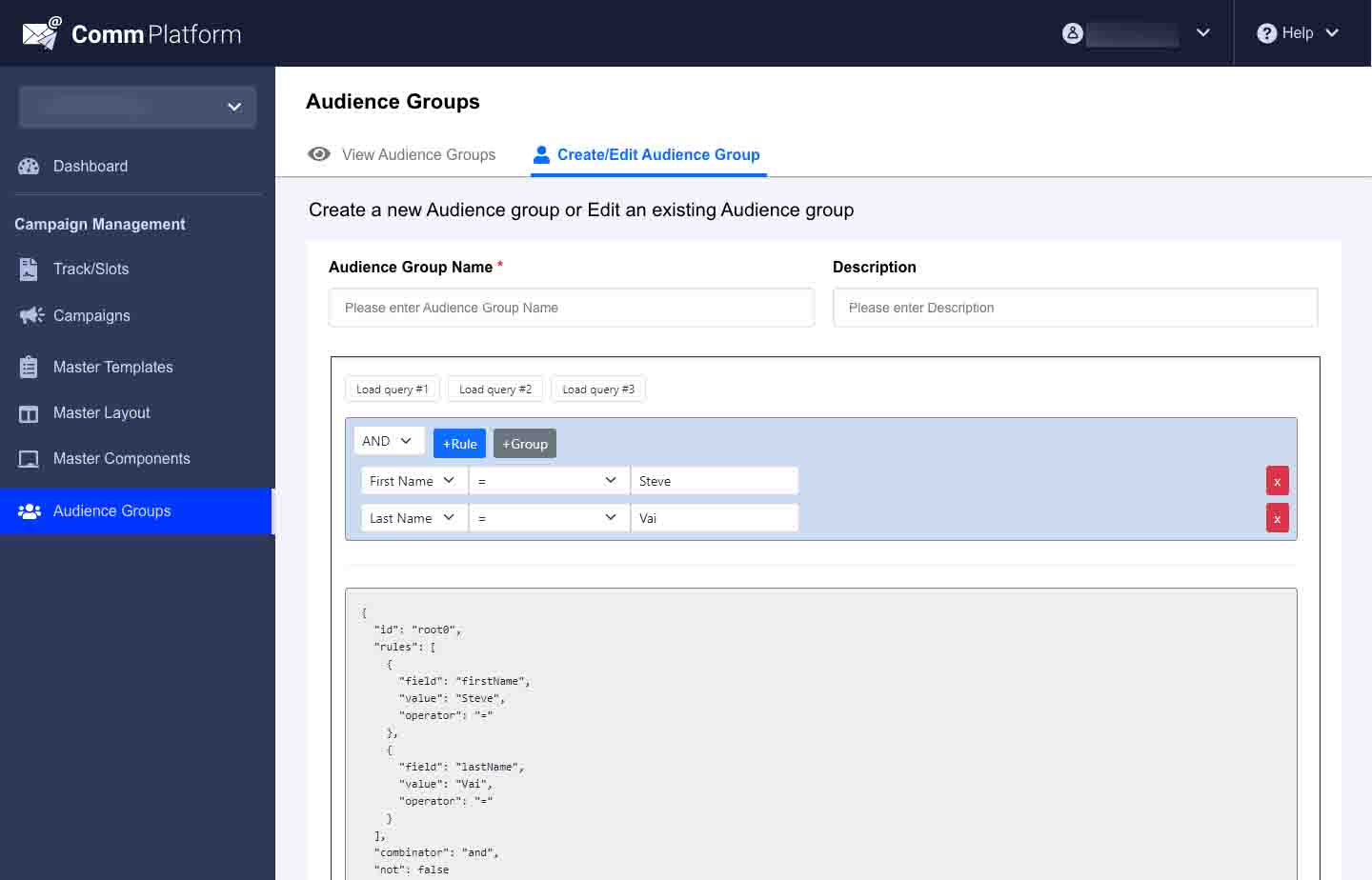
Final screens solving the core problems of this product
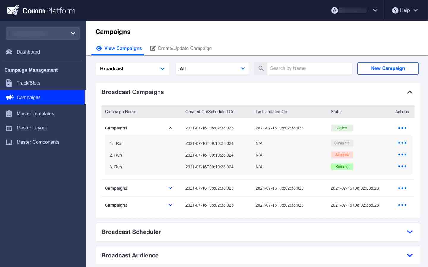
In the redesigned experience, campaign management is divided into two clear sections: View Campaigns and Create Campaigns.
The View Campaigns section provides a centralized dashboard where users can easily access and manage all campaigns. Users can quickly identify campaigns based on their status, such as Running, Active, Stopped, or Completed. To improve efficiency, users can duplicate an existing campaign and launch it again with a different name or template while retaining all other campaign settings, reducing repetitive work and setup time.
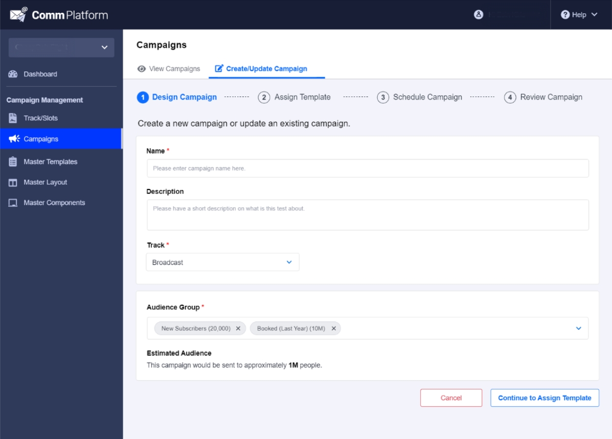
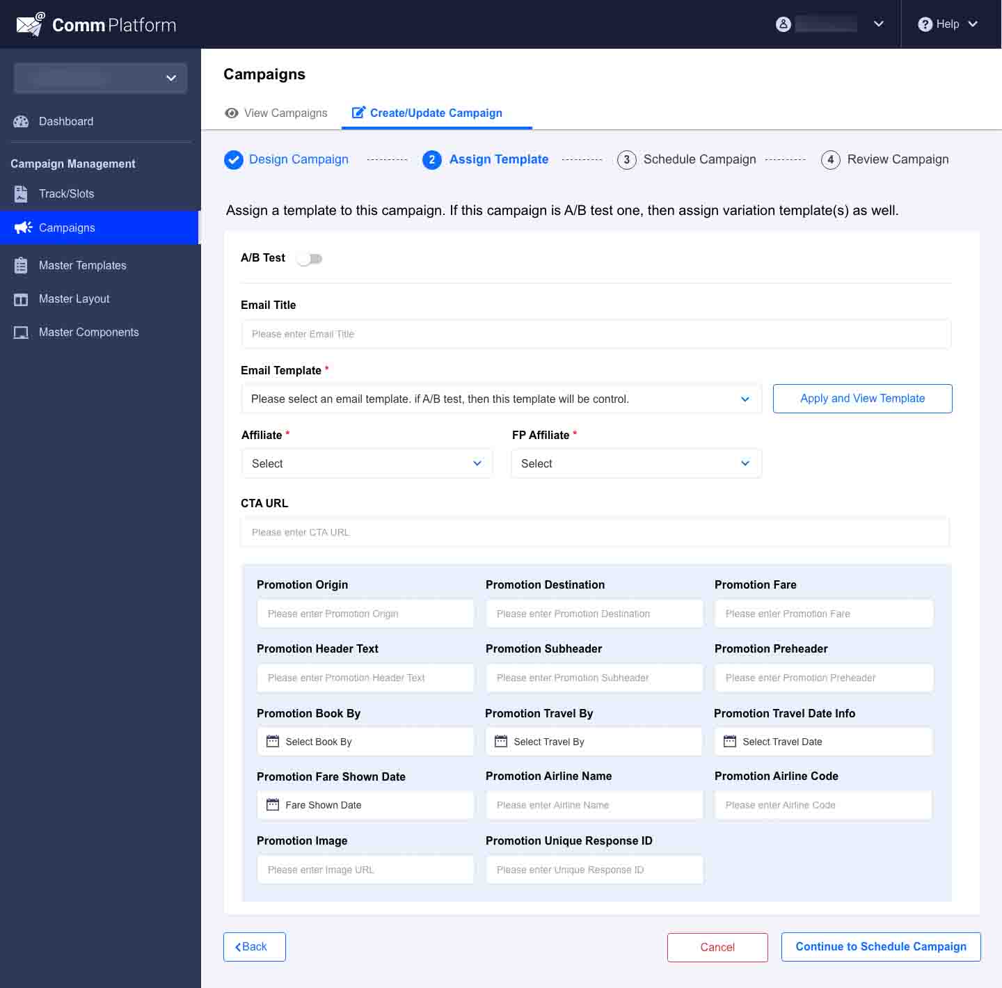
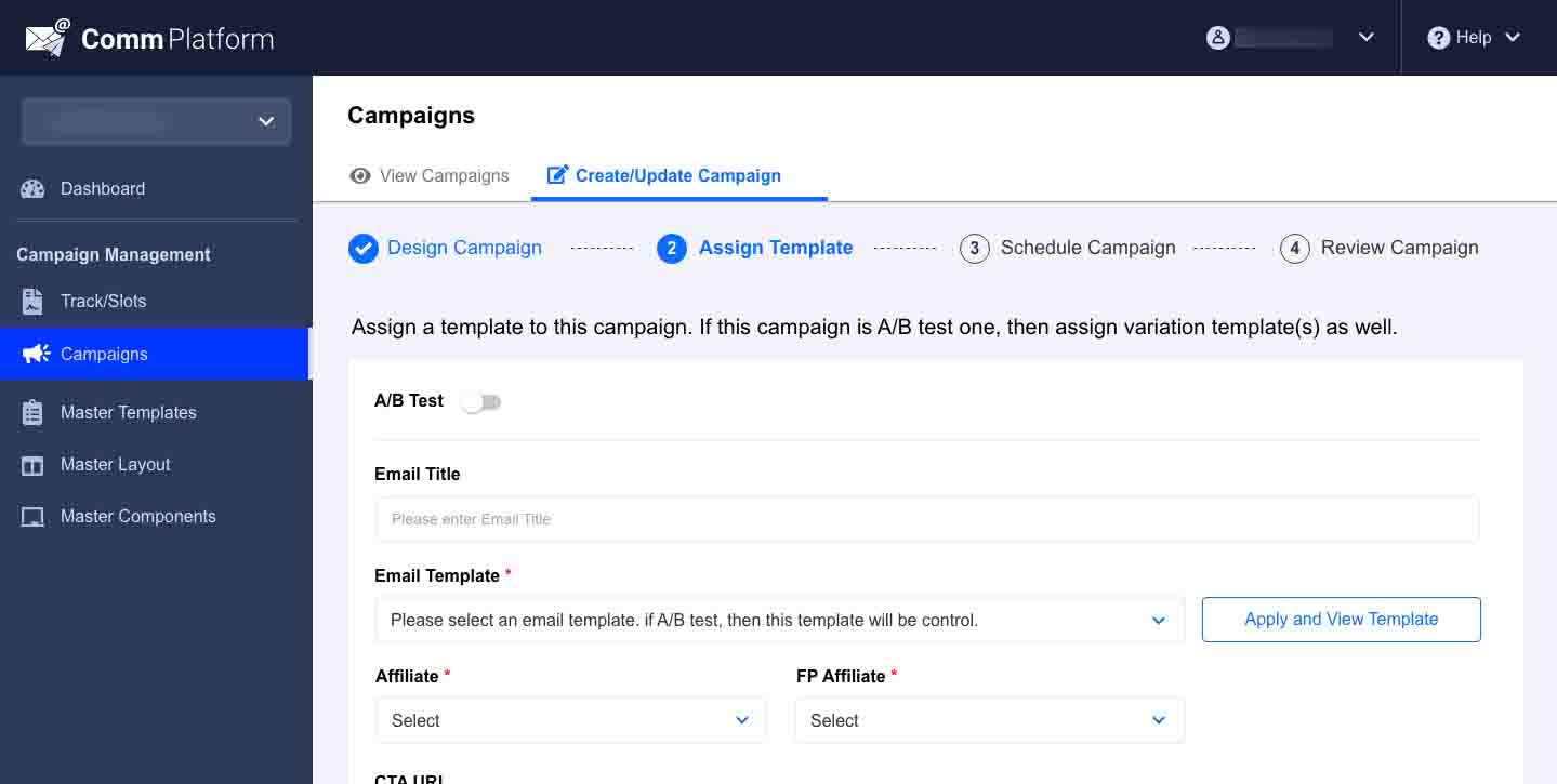
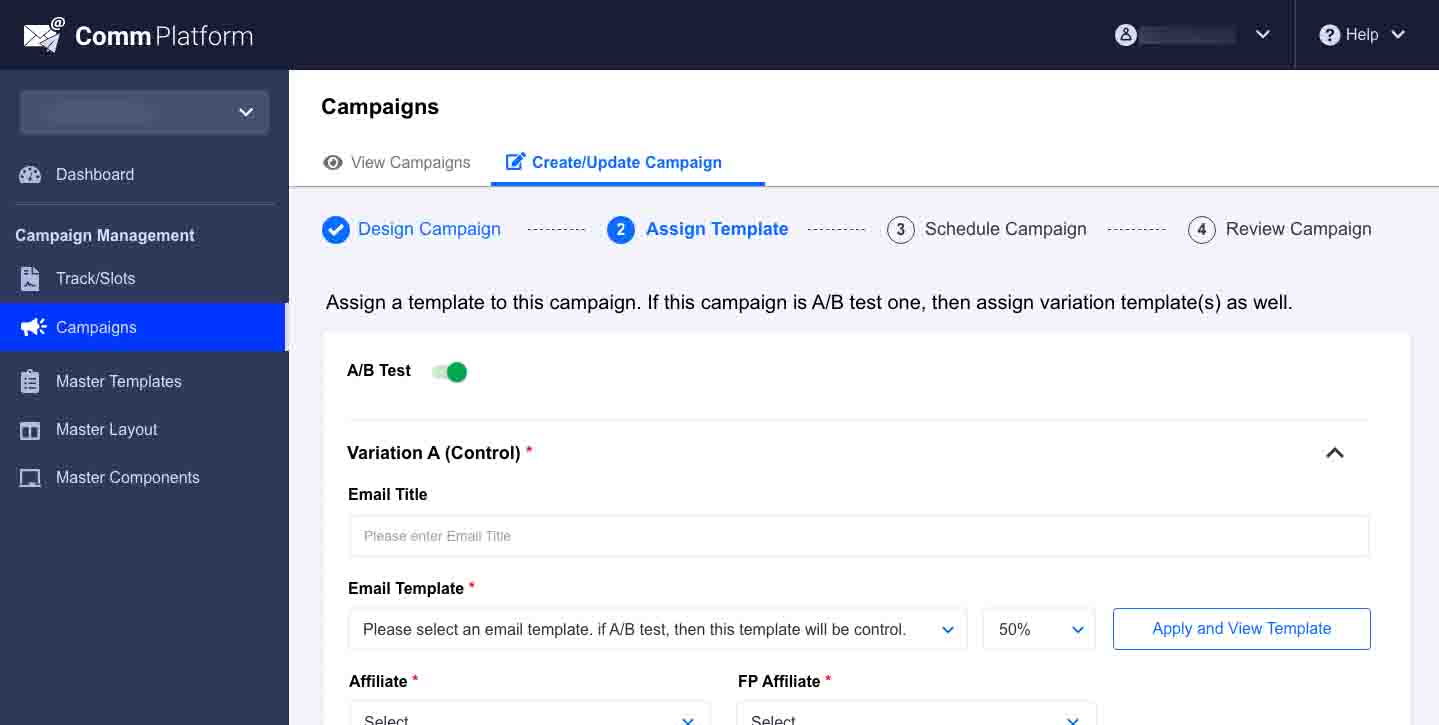
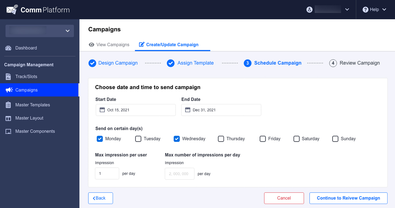
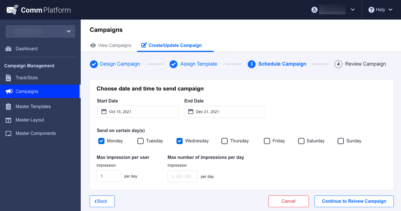
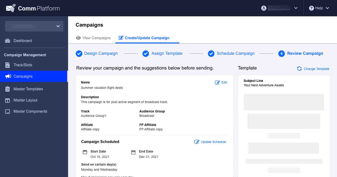
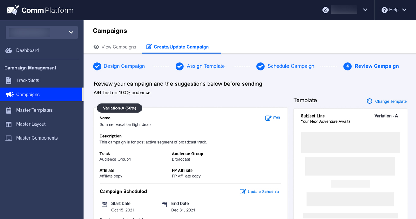
The Create Campaigns section introduces a guided 4-step workflow that simplifies campaign creation and provides clear visibility into the process. Users always know their current step, what information is required next, and how much progress has been made. Campaigns can be saved as drafts at any stage, allowing users to return later and continue from where they left off.
The workflow begins with Audience Selection, ensuring users define the target audience before configuring the campaign. This helps users choose the most relevant audience segment and improves campaign targeting. Subsequent steps make it easy to assign templates, configure scheduling, review campaign details, and publish campaigns with confidence. The structured flow reduces complexity, improves usability, and enables users to create and launch campaigns more efficiently.
Impact
Business Impact
- Reduced dependency on external communication platforms.
- Improved control over customer data and security.
- Established a scalable foundation for high-volume communications.
- Enabled future growth toward multi-million user campaigns.
- Increased operational flexibility and platform ownership.
User Impact
- Simplified campaign creation process.
- Better visibility into campaign lifecycle.
- Faster access to campaign management actions.
- Reduced learning curve for new users.
- Improved efficiency through campaign duplication and drafts.
What I Learned
Designing enterprise products at scale is often less about visual design and more about simplifying complex workflows.
This project reinforced the importance of aligning business goals, technical constraints, and user needs into a single cohesive experience. By reducing workflow complexity and improving visibility, we created a platform that not only improved usability but also supported long-term business objectives around security, scalability, and operational ownership.