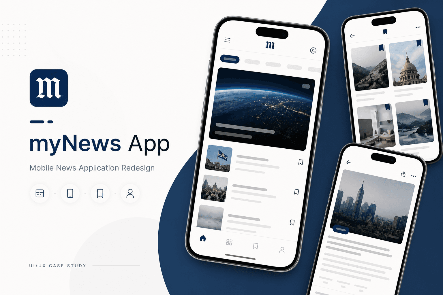
Background
The original myNews app shipped as an MVP — enough to publish stories, not enough to compete. Content was hard to browse, engagement features were missing, and there was no account layer for save-for-later or sharing.
Problem Statement
Readers couldn't find desirable content quickly. Without login, personalisation, or bookmarking, sessions were shallow — and promotional inventory underperformed because users didn't stay.
Business Opportunity
A redesigned app with organised sections, accounts, and location-aware content would increase engagement, create surfaces for marketing, and align the product with category expectations.
Proposed Solution
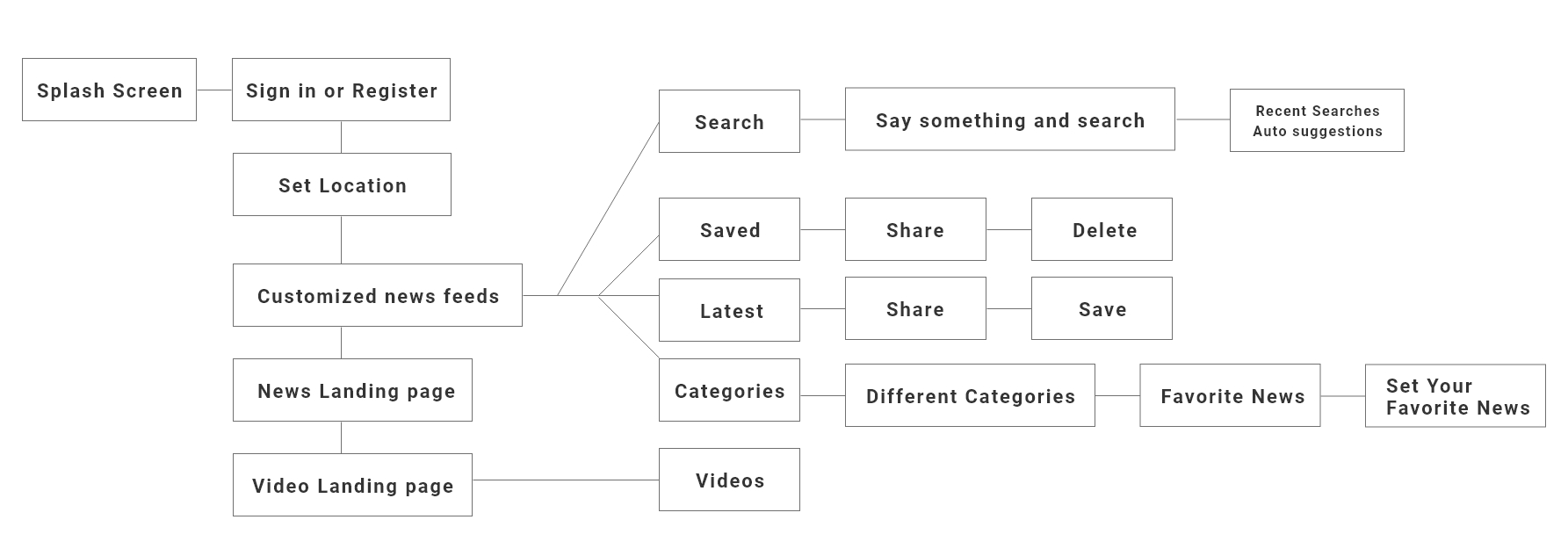
I redesigned flows from first open through registration, location setup, and personalised reading — balancing logged-in richness with a usable logged-out browse mode.
My role & UX approach
- Audited competitors to benchmark feed patterns, auth flows, and engagement mechanics
- Built personas and journey maps highlighting discovery, reading, and return visits
- Facilitated PO workshops to sequence MVP features vs. later releases
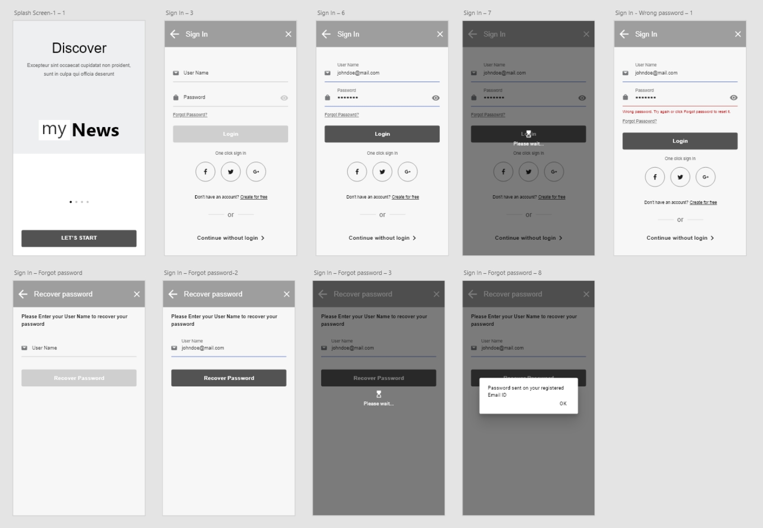
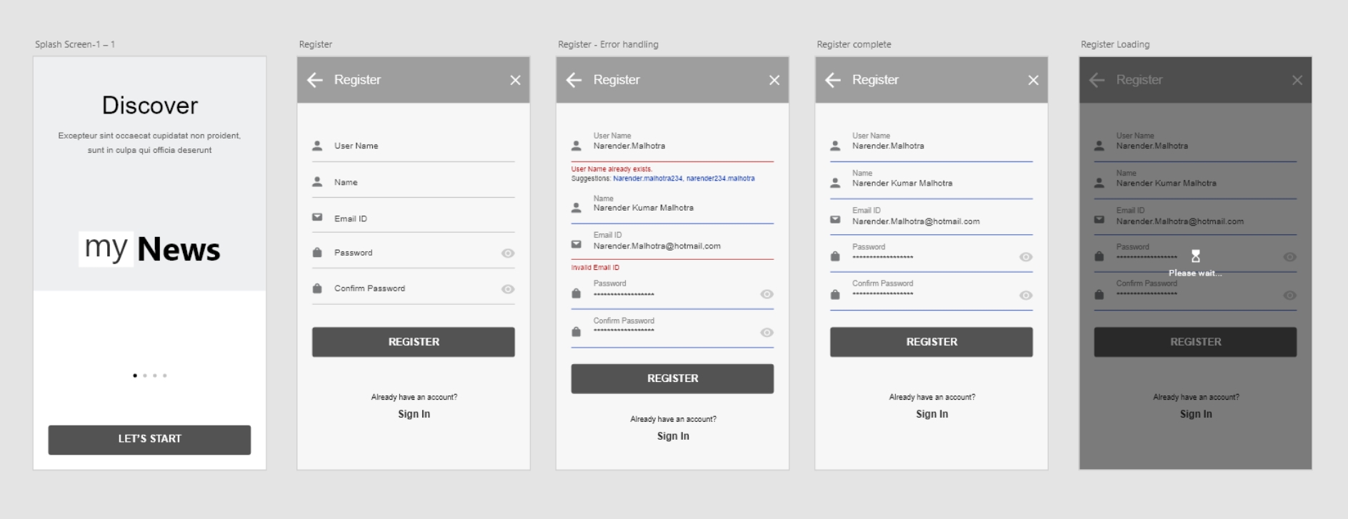
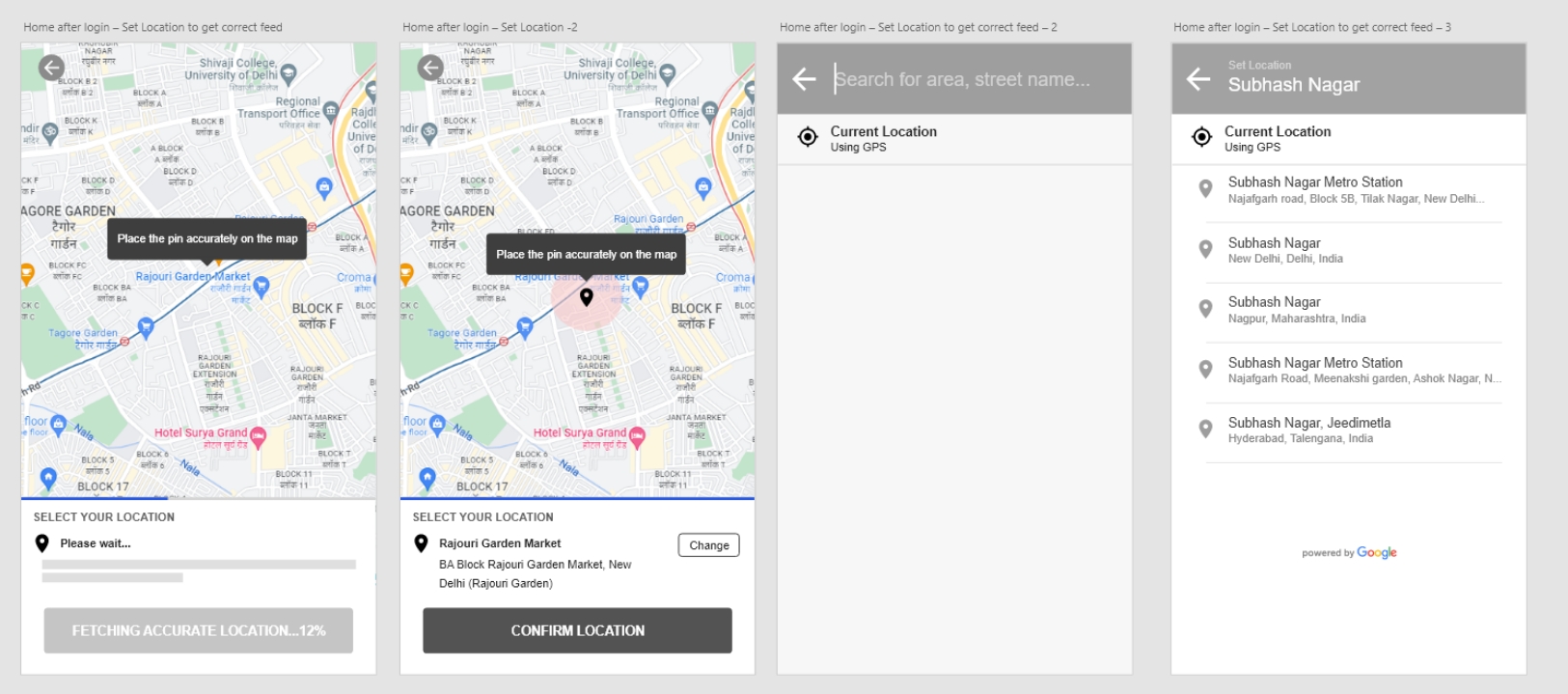
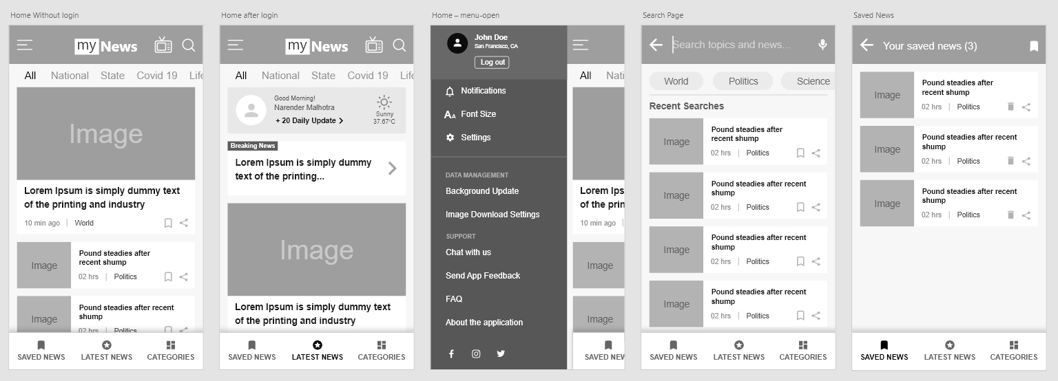
- Wireframed and designed sign-in, registration, location picker, and home feed variants
- Validated navigation depth — enough categories without overwhelming first-time users
Sign in & register flow
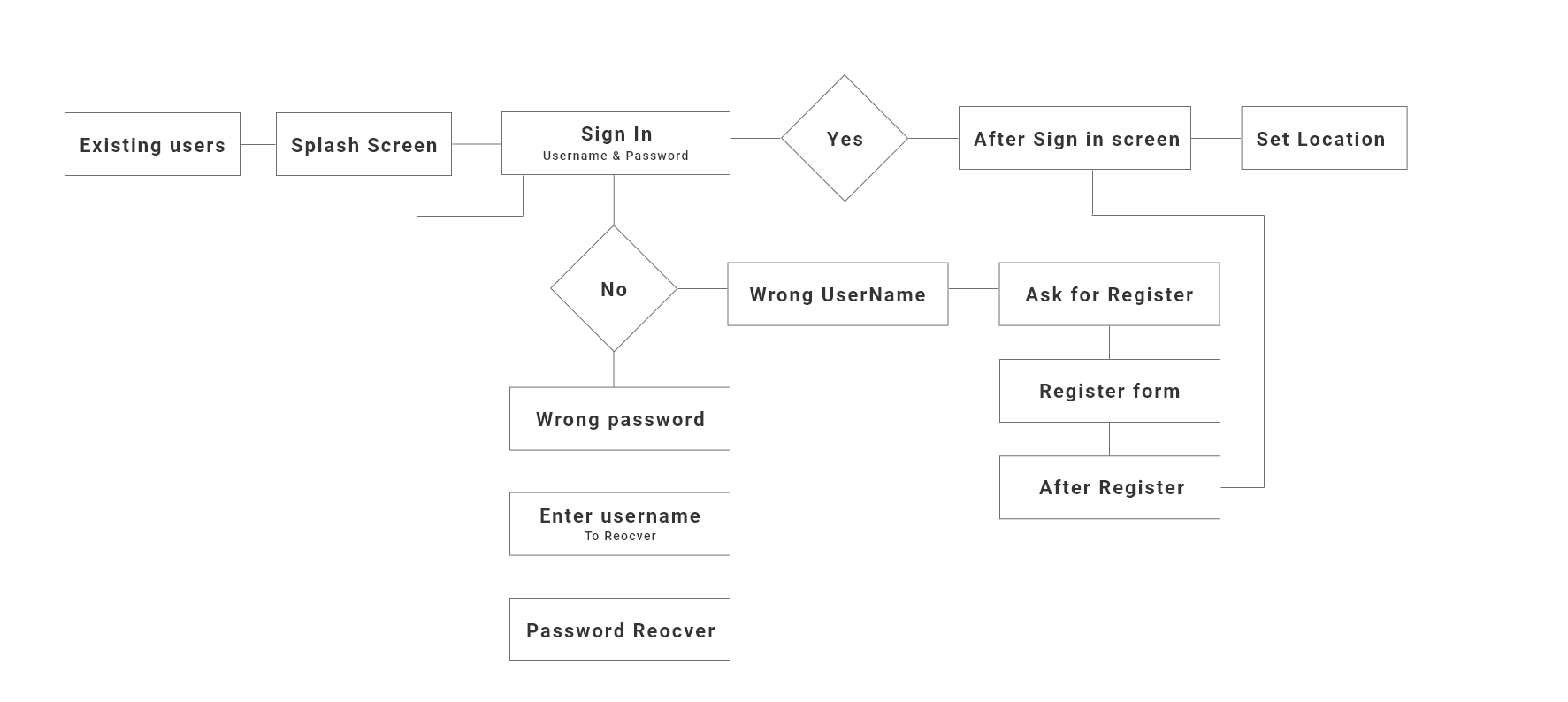
User flow
Wireframes
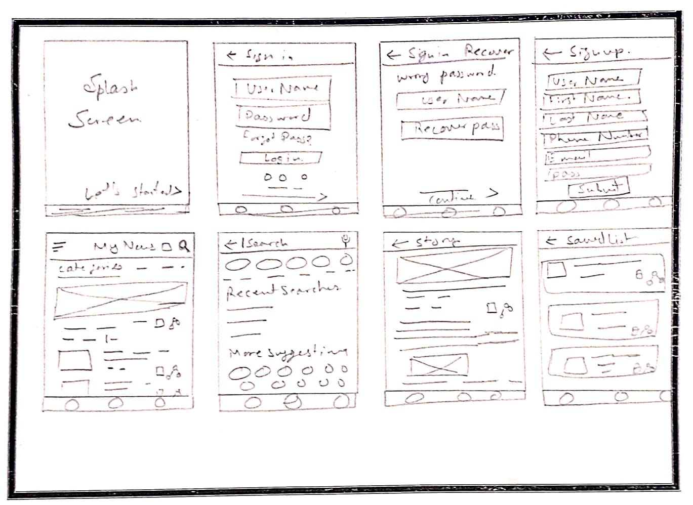
Sign in
Register
Set location
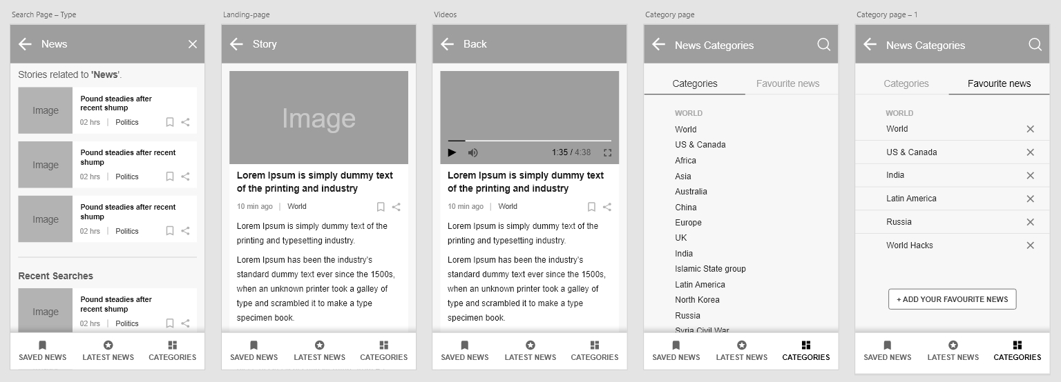
Logged-in & logged-out experiences
Outcomes
- Higher session engagement and return frequency
- Stronger promotional performance as users spent more time in-feed
- Growth in new user registrations
- Clearer, more predictable navigation vs. the legacy MVP
My learnings
Starting from flow diagrams exposed usability debt in the old app before we touched pixels. Competitive analysis set a concrete feature bar — users expect save, share, and personalisation as baseline. Designing both auth states upfront prevented a common trap: optimising only for logged-in power users.