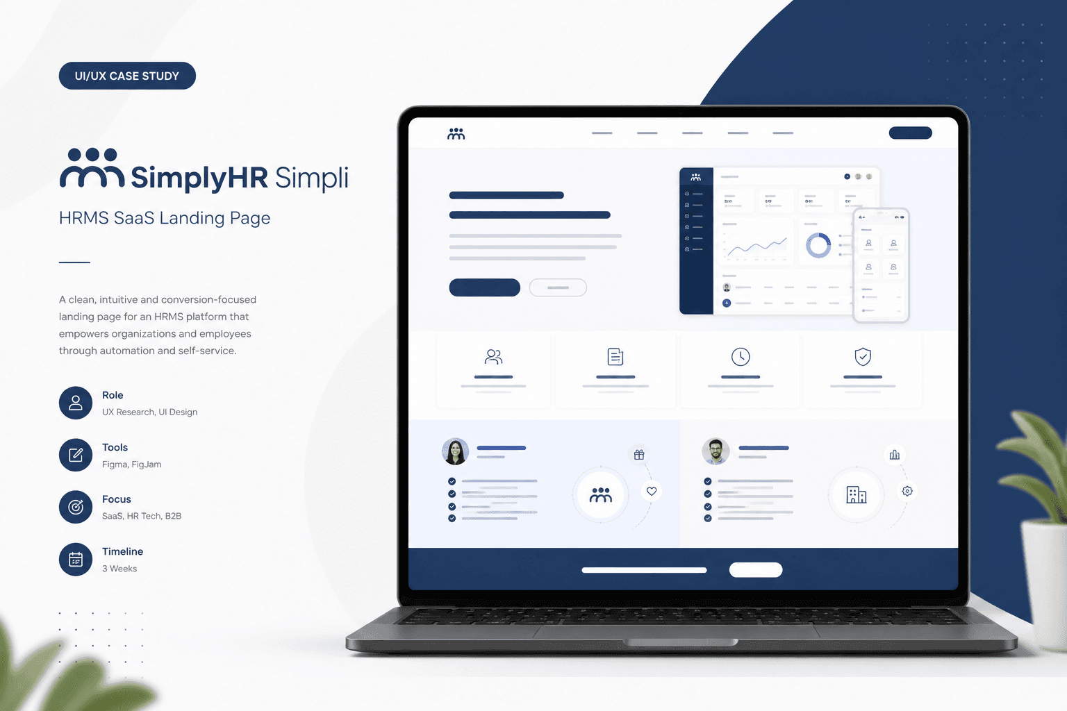
Background
SimplyHR needed a landing page for Simpli — their HRMS platform — that could stand out in a crowded HR tech market and convert HR leaders and business owners into demo requests.
Problem Statement
Prospects compare multiple HR tools in minutes. Simpli's page had to immediately communicate dual value (employees and employers), build trust, and make the next step obvious — without feature overload above the fold.
Proposed Solution
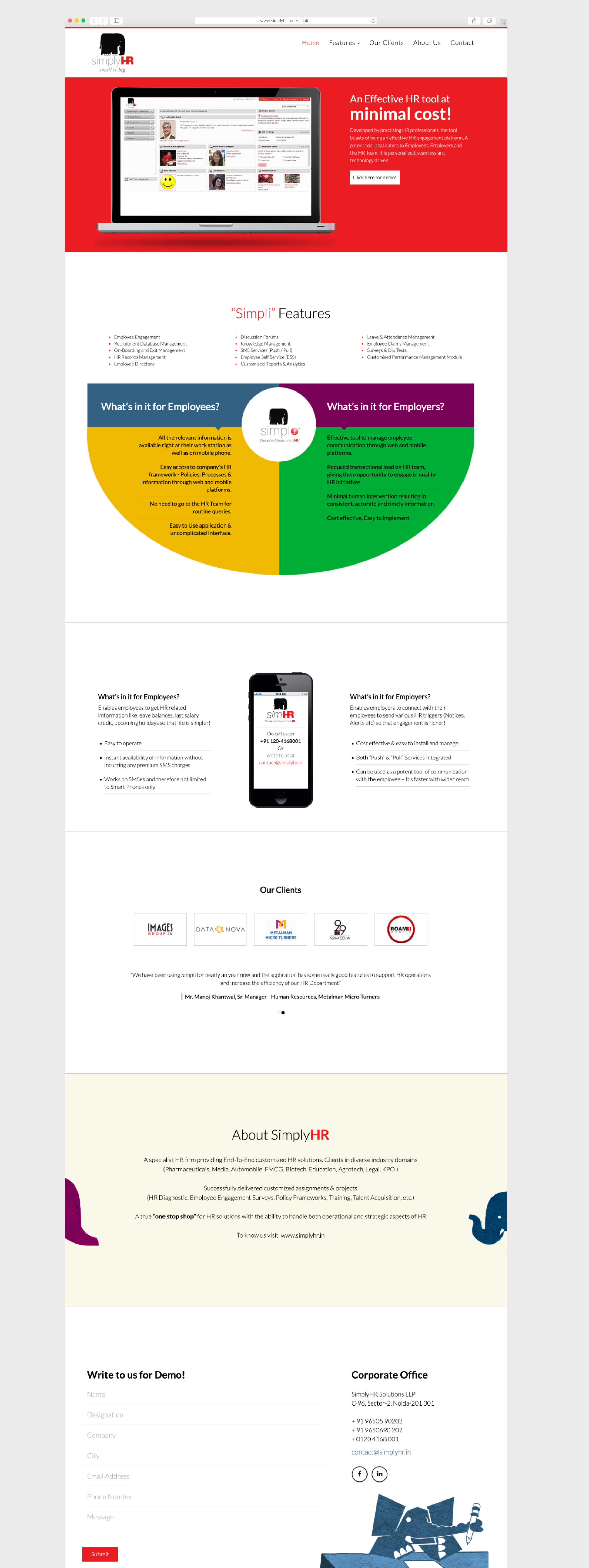
I designed a structured landing experience: hero with sharp positioning, feature blocks with visual support, social proof zones, and CTAs placed at natural decision points — desktop and mobile.
My role & UX approach
- Interviewed stakeholders on primary conversion goal and objection-handling messages
- Reviewed competitor landing pages for CTA placement, proof patterns, and section rhythm
- Prioritised scannability — short blocks, consistent iconography, clear employer/employee split
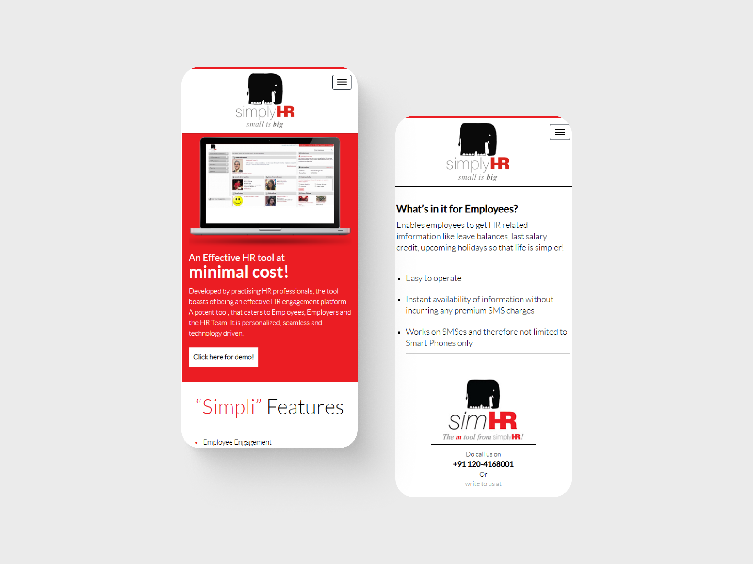
- Designed responsive layouts so mobile users get the same narrative arc without endless scroll fatigue
Landing page design
Impact
- Higher on-page engagement — users explored further down the page
- Improved click-through on demo request CTAs
- More professional brand perception aligned with enterprise HR buyers
My learnings
First impressions are structural, not decorative — messaging hierarchy and CTA timing drive conversions more than illustration style. Minimal, confident layouts helped HR buyers scan fast and act when ready.