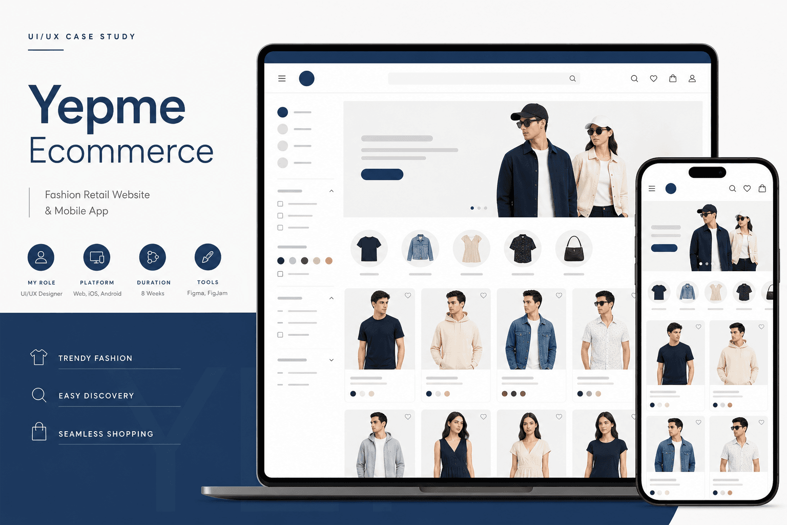
Background
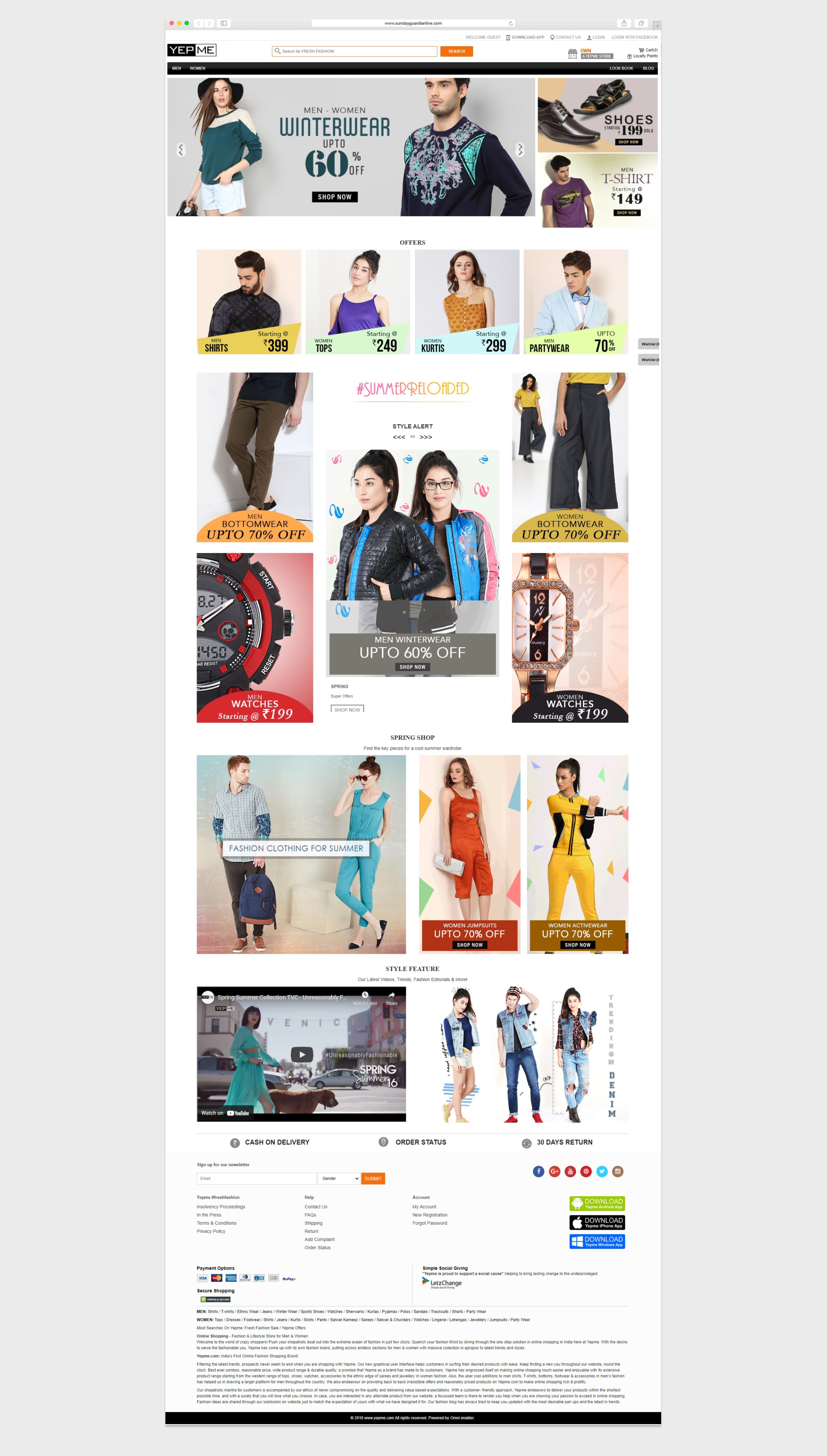
Yepme needed a visual refresh before two major TV ads went live — traffic was coming, but the existing shop experience didn't showcase products effectively or guide users through filter-and-buy tasks quickly enough.
Business Opportunity
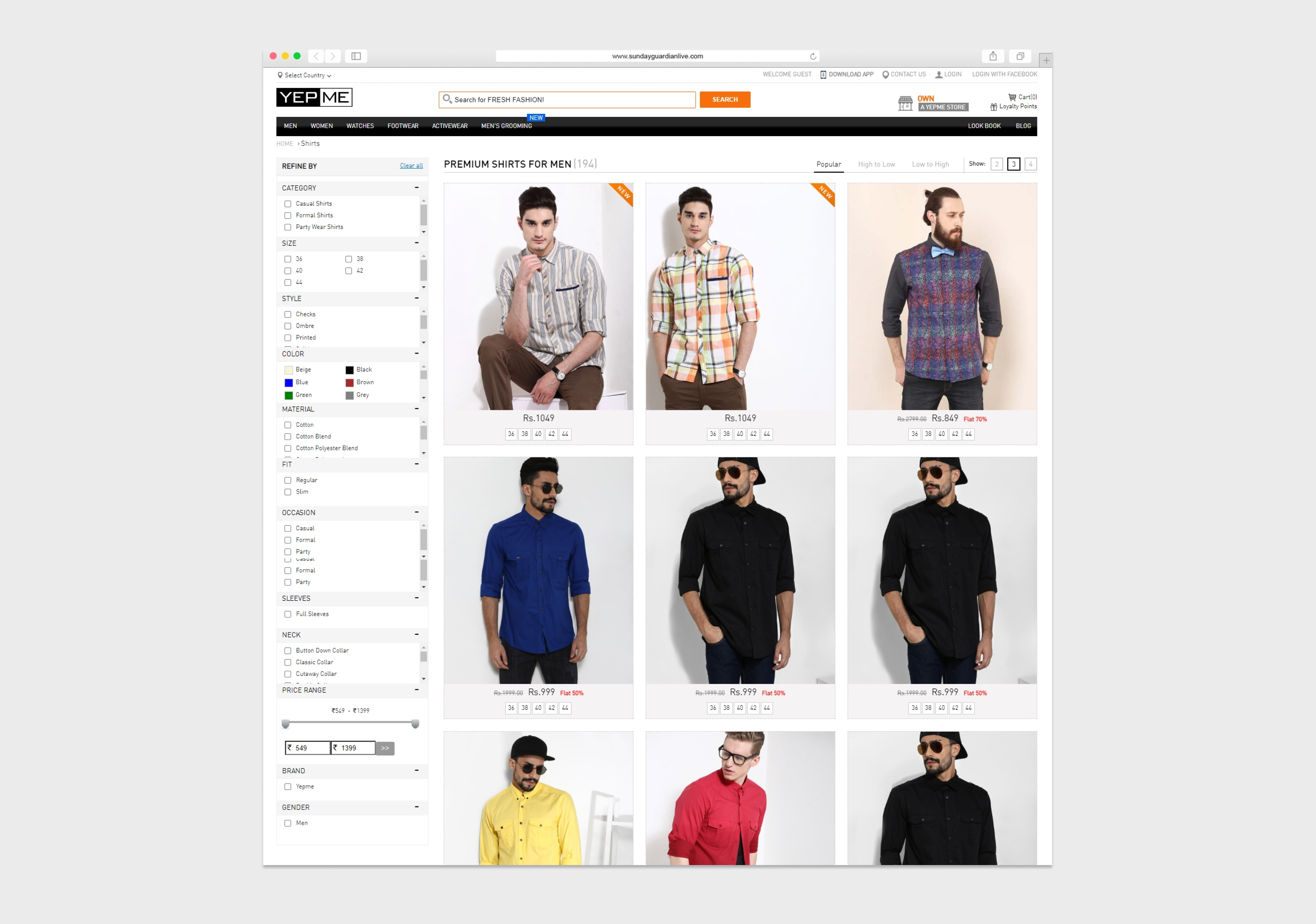
Better homepage merchandising, clearer listing pages, and improved filter UX would convert campaign traffic into repeat customers — reducing bounce from visitors who couldn't find styles in their size or category.
Proposed Solution
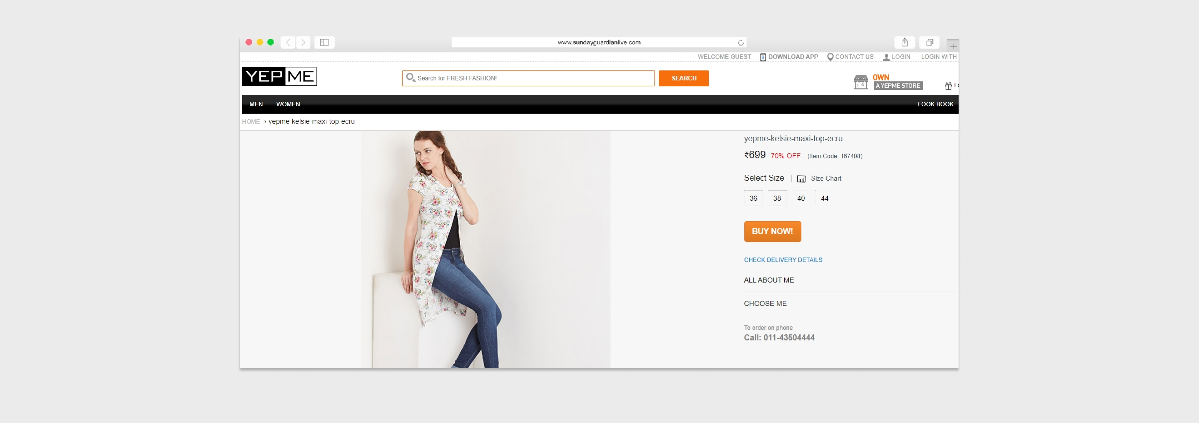
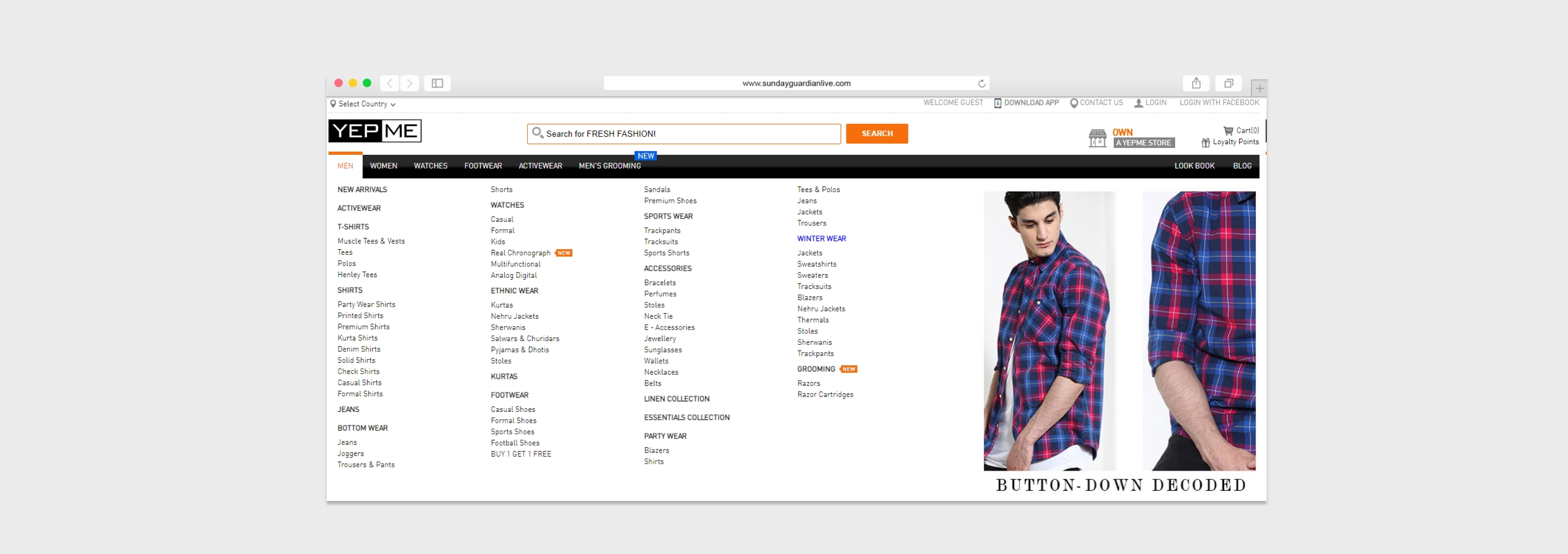
I redesigned the homepage and listing experience for the MVP launch: stronger product tiles, clearer category entry points, and filter patterns that match how fashion shoppers actually narrow choices.
My role & UX approach
- Aligned with stakeholders on campaign-driven priorities — what must ship vs. what could follow
- Benchmarked fashion ecommerce patterns for grid density, filter placement, and promotional zones
- Restructured IA for faster paths from homepage → category → product
- Delivered responsive UI for web and app with consistent component language
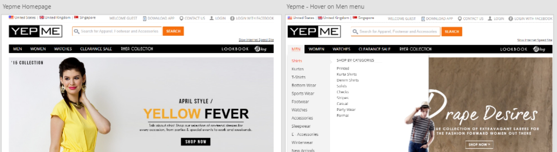
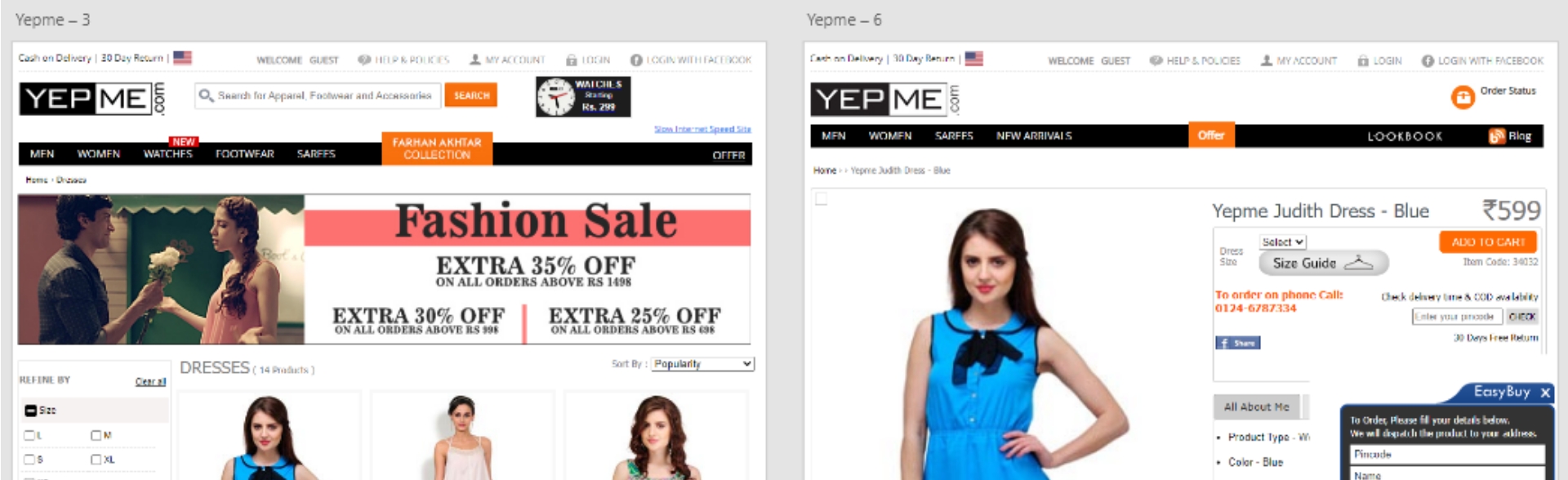
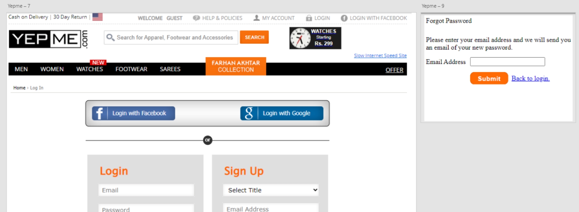
Before — legacy experience
After — redesigned experience