Background
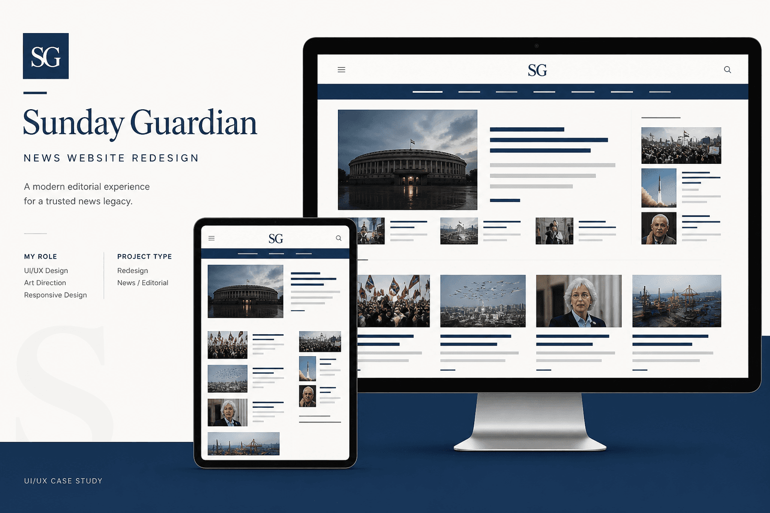
Sunday Guardian is content-rich — but the legacy site buried stories under poor hierarchy. Readers struggled to find relevant articles, especially on mobile and tablet where the experience broke down entirely.
Problem Statement
The site looked dated, lacked responsive behaviour, and failed basic usability heuristics identified in testing: unclear navigation, weak scan patterns, and no coherent information architecture across sections.
Business Opportunity
A modern, responsive redesign would improve time-on-site, reduce bounce on mobile, and give the editorial brand a credible digital presence competitive with leading online newspapers.
Proposed Solution
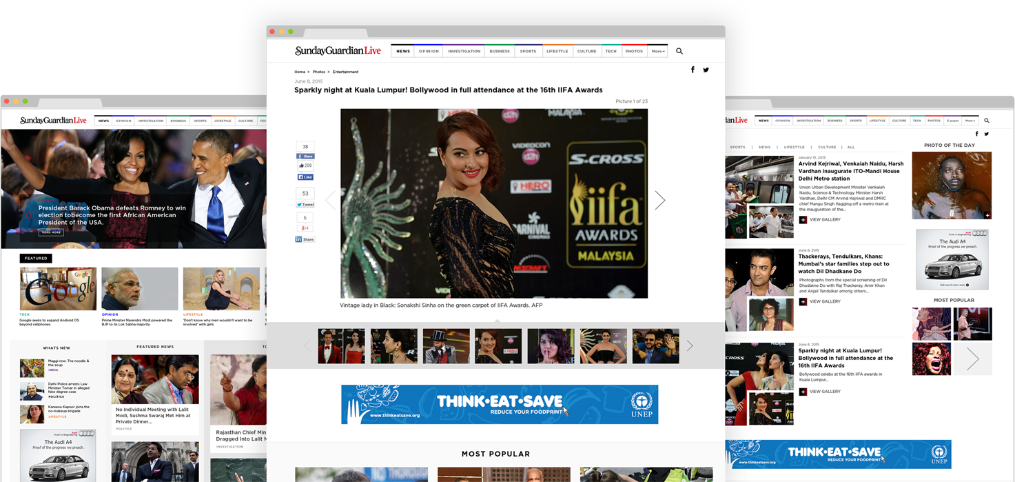
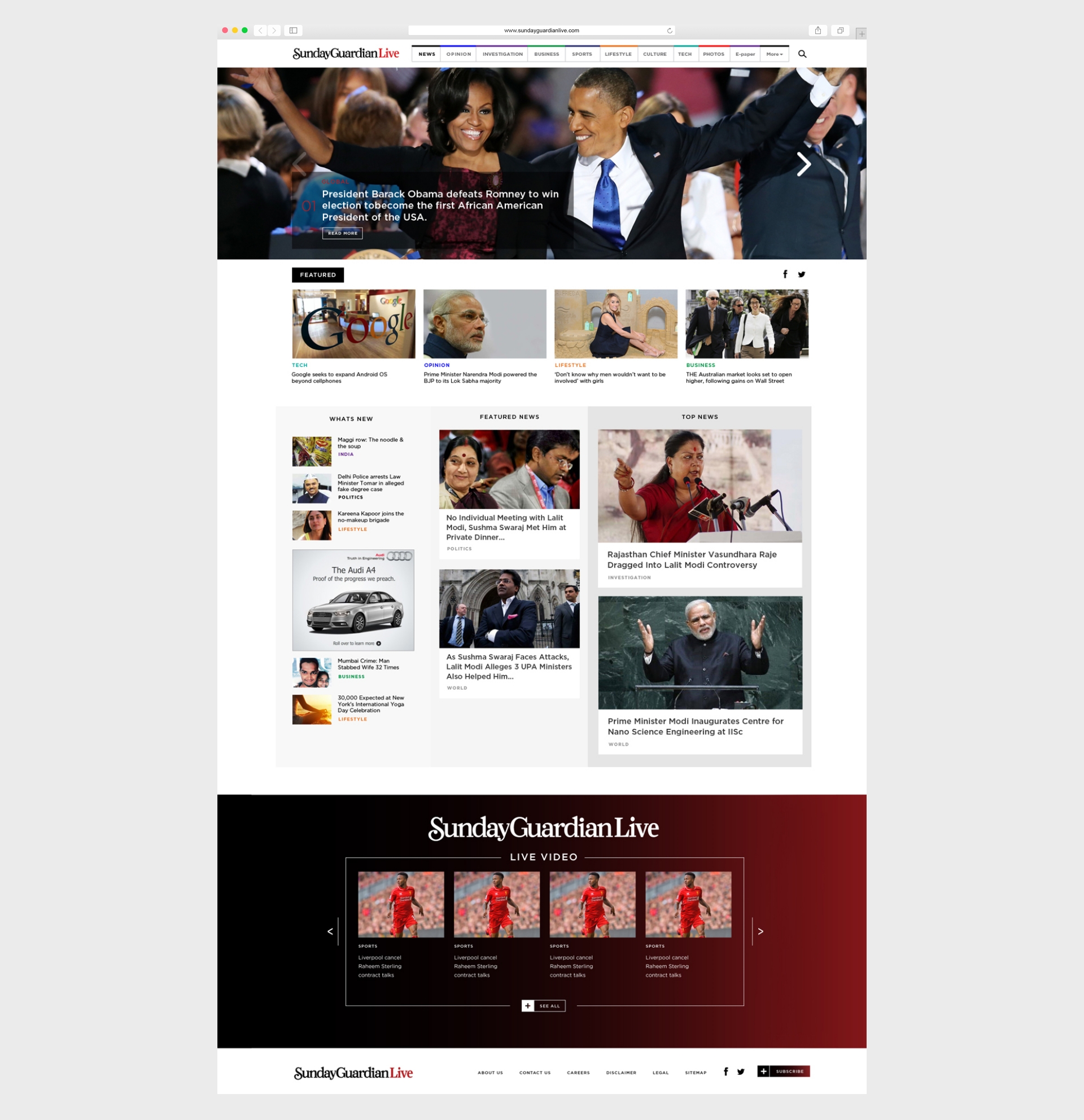
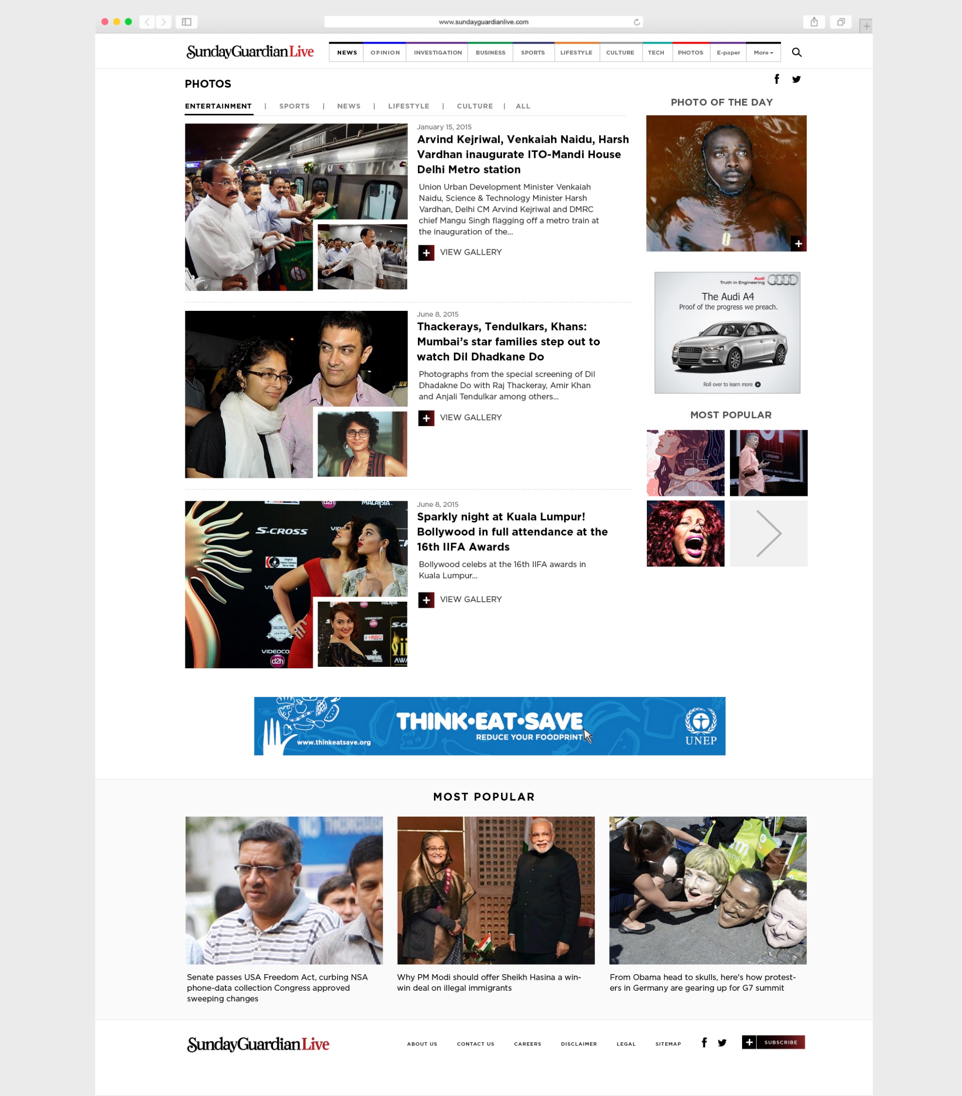
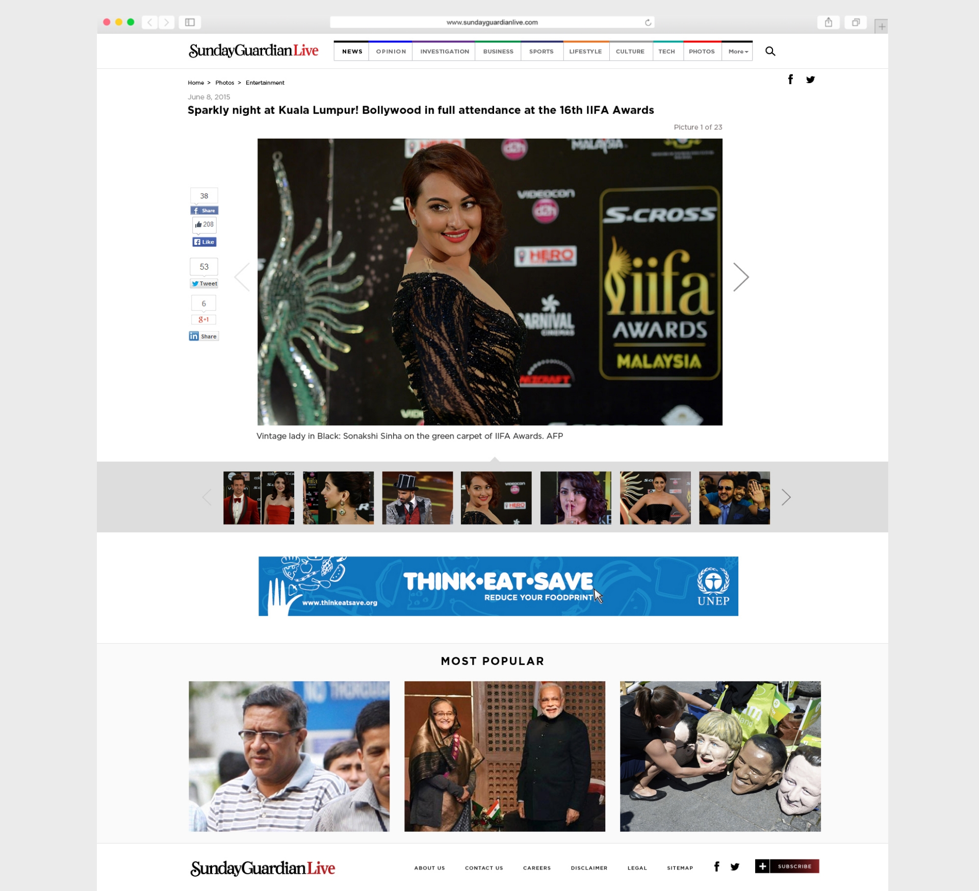
I restructured navigation and page templates around reader tasks — breaking news, section browse, and article reading — with typography and spacing tuned for long-form reading on every breakpoint.
My role & UX approach
- Gathered requirements with editorial and business stakeholders
- Reviewed competitor news sites for hierarchy, homepage rhythm, and mobile patterns
- Defined new IA and reader flows before visual design — section logic first, chrome second
- Designed responsive templates prioritising headline clarity, related content, and ad/viewability balance
Design explorations