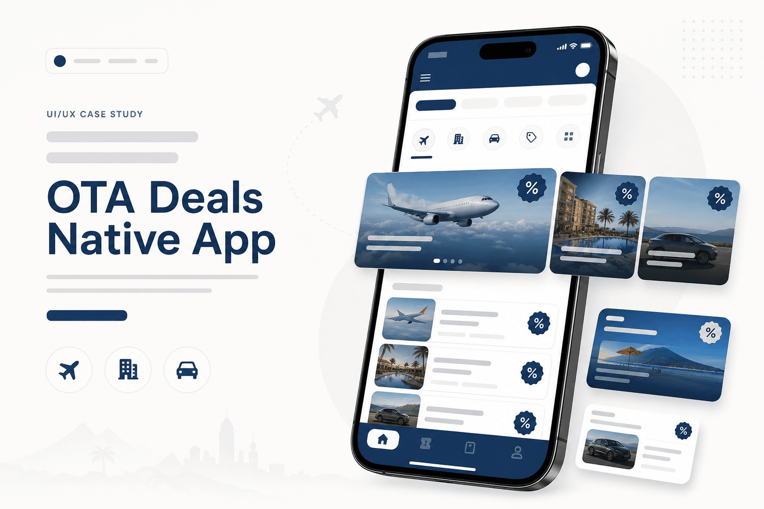
Background
Deal-seeking is default behaviour in travel apps — yet our native product had no dedicated surface for offers. Users left for OTAs that surfaced discounts prominently, and we missed conversion moments tied to search history and origin market.
Problem Statement
Without a deals module, the app felt incomplete compared to Expedia, Kayak, Hopper, and regional players. Discovery was passive; users couldn't browse or filter offers aligned to their trip intent.
Business Opportunity
A deals tab could increase session depth, improve retention, and capture price-sensitive bookers — especially for flights, hotels, cars, and packages — without rebuilding the entire app.
Proposed Solution
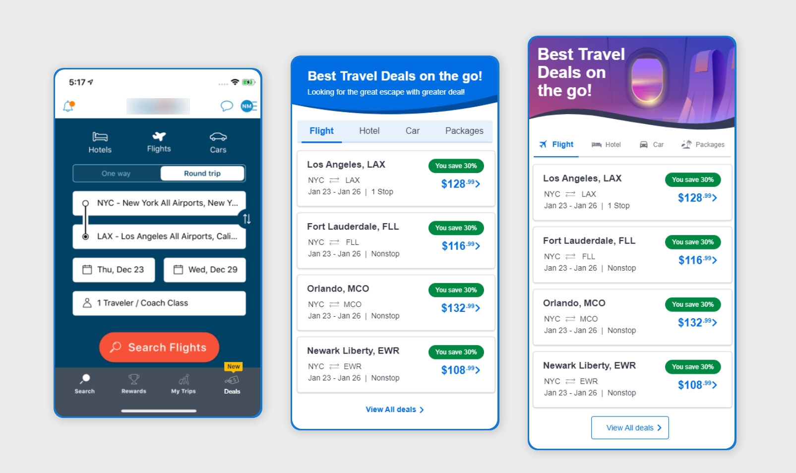
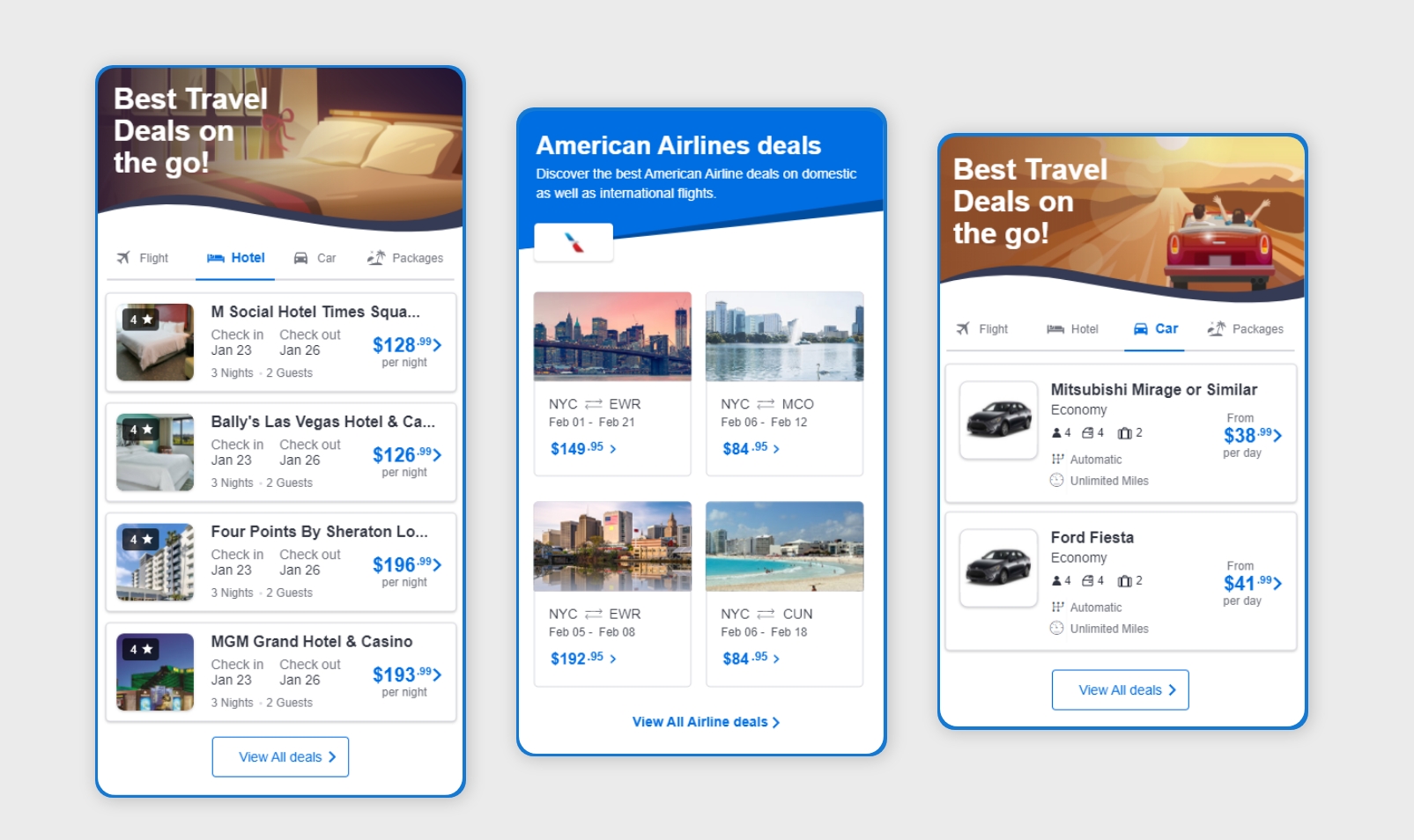
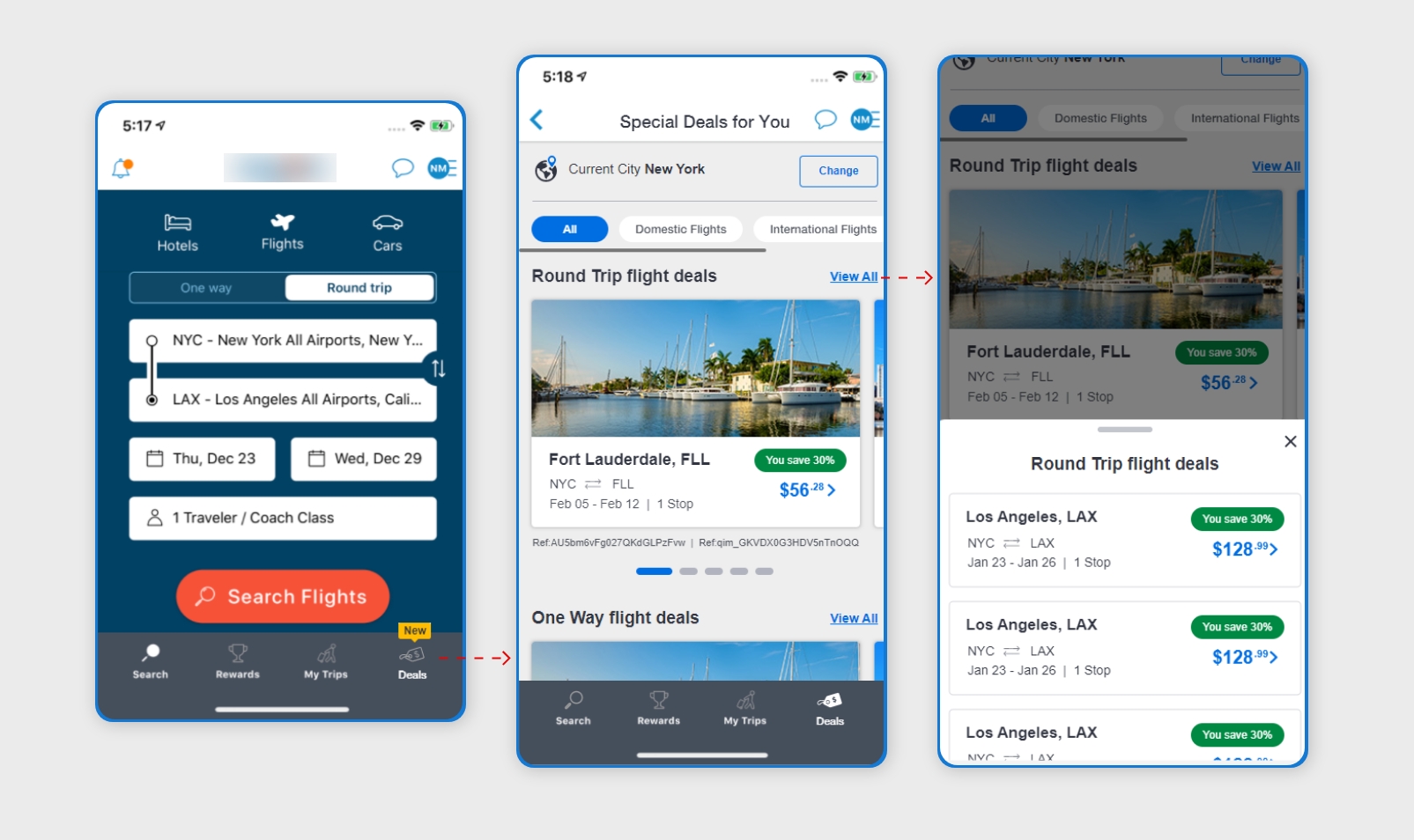
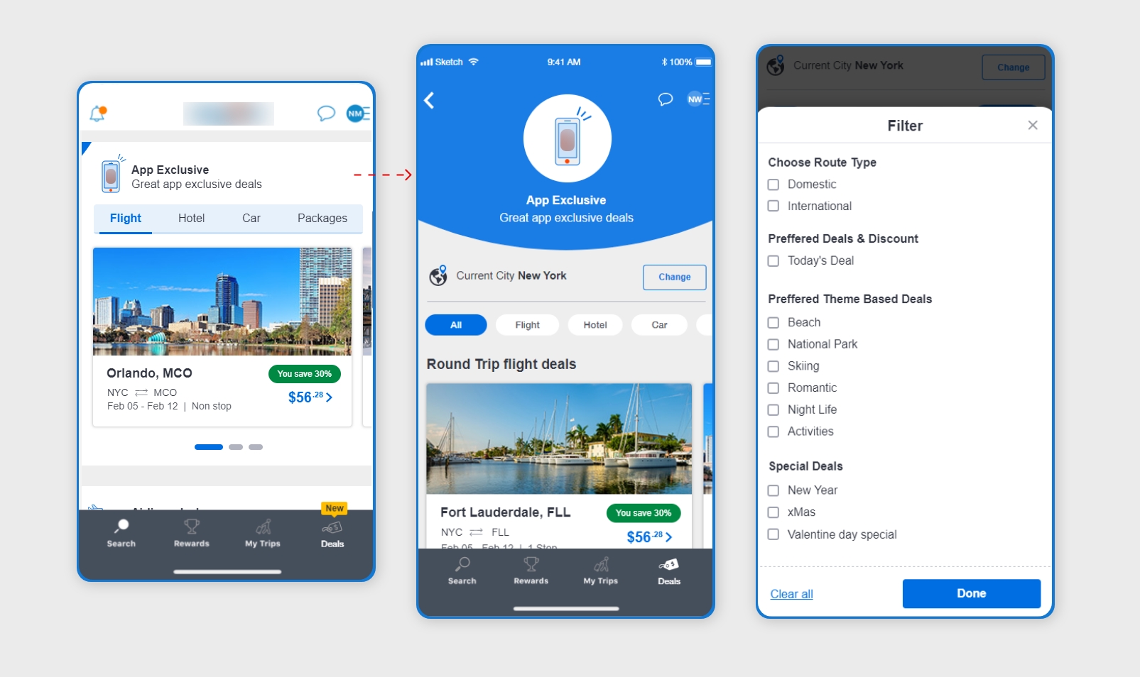
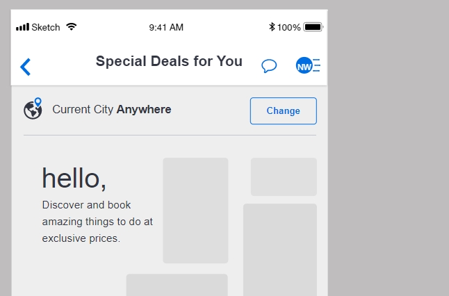
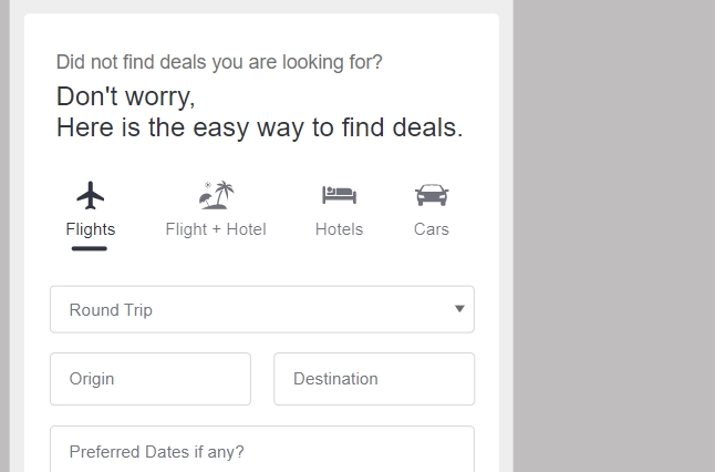
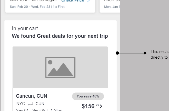
I designed a classified deals experience: entry from main navigation, scannable offer cards, and filters informed by search context and origin — making promotions feel personal rather than generic banner noise.
My role & UX approach
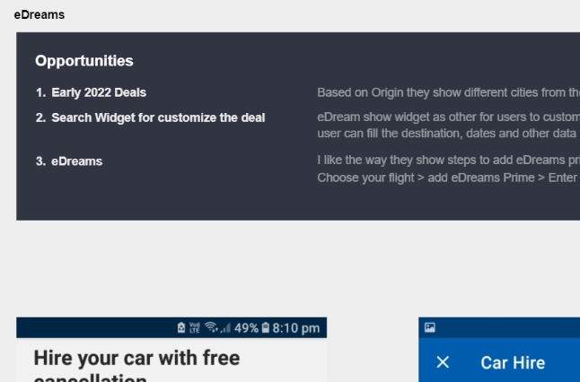
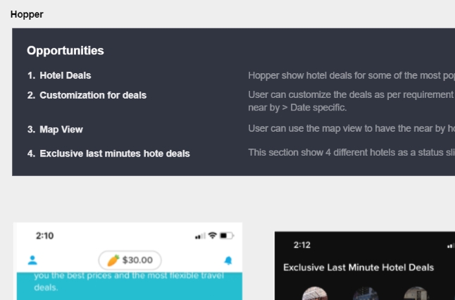
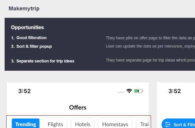
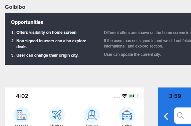
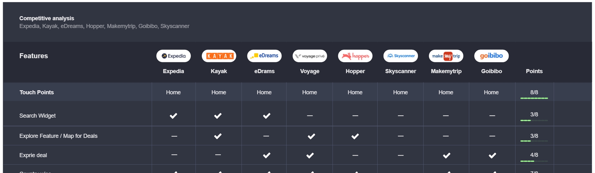
- Audited six competitor deal patterns to extract layout, taxonomy, and urgency cues worth adapting
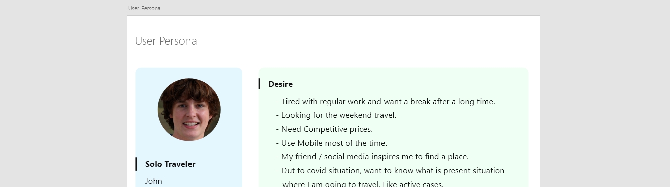
- Built a primary persona around the deal-driven traveller — budget-aware, comparison-heavy, mobile-first
- Facilitated stakeholder workshops to align on MVP scope vs. future personalisation
- Mapped IA and screen flows from tab entry through offer detail and booking handoff
- Iterated wireframes to low- and high-fidelity UI with consistent card components and category wayfinding
User persona
Competitive analysis
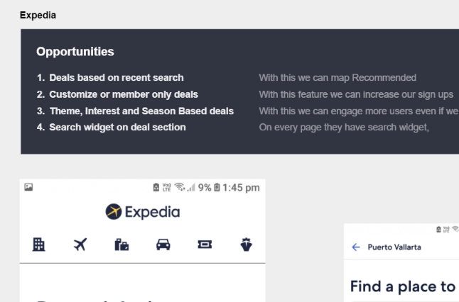
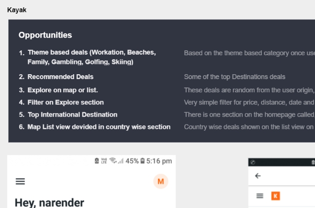
Research synthesis
Wireframes
UI design